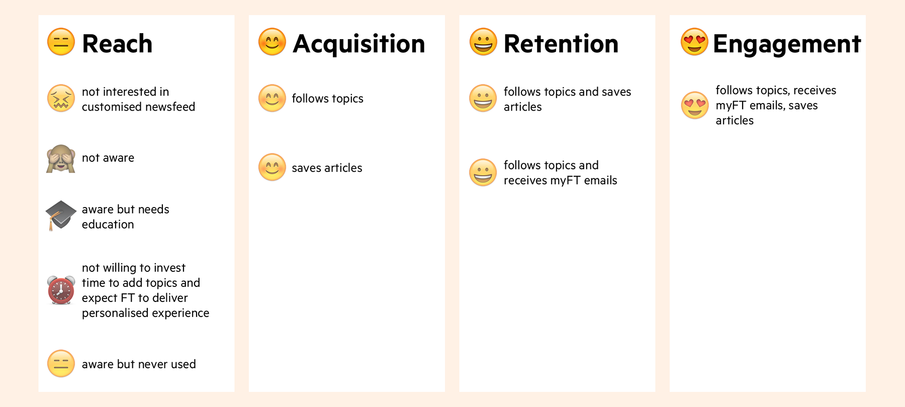
User motivation and behaviour that is mapped into myFT engagement funnel. Based purely on
qualitative research.
Outcome summary
myFT homepage component
First A/B test was to identify which component performed the best for non myFT users: old topic card layout, article based onboarding or topic based onboarding.
The results showed 22% uplift in CTR of the topic based component in comparison to a control variant.
Article based component showed -1% CTR.
myFT feed
New design of the topic card with an extra article on myFT feed page performed well in A/B test showing 10% uplift in comparison to the control variant.
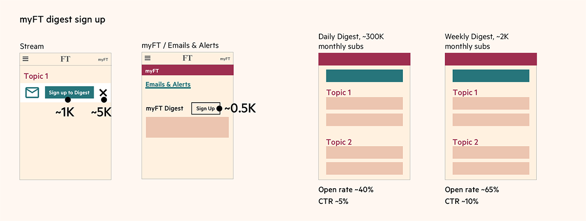
myFT digest email
Both the open and CTR were improved by the redesign. The open rate went up by 5% vs. the control, and the CTR went up by 10%.
Project components
MyFT is a multifaceted feature so during the course of my work from October 2016 till December 2017 I improved the experience of myFT Digest email, worked on myFT homepage component
and myFT feed. MyFT is also a main driver of engagement based on frequency and recency of the visits and volume of the articles read on FT.com.
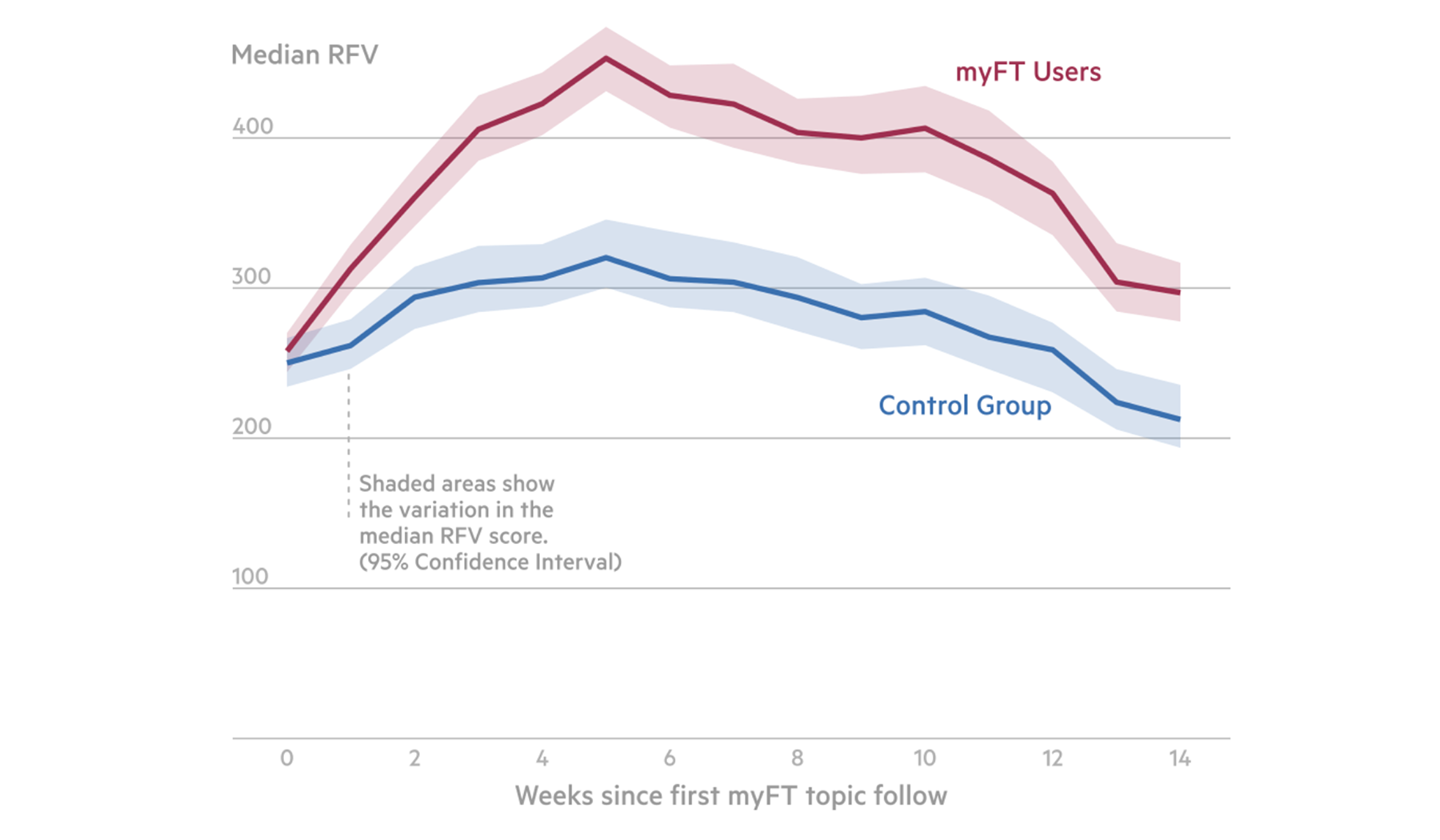
MyFT increases engagement by 86% (you can find more information in this PDF ).
Analysis from the data science team that indicates impact of following topics on myFT on engagement.
Cait O'Riordan, Chief Product and Technology Officer, speaks about myFT and its role to the FT business model.
I spent about 12 months working on myFT homepage component , myFT feed page and myFT Digest email redesign.
This section is quite long and full of details so feel free to skip to the section you are most interested in.
I truly believe if you spend quality time understanding the problem and your customers, the results of qualitative research will inform
your design decisions and will manifest in successful A/B test results. You need to combine qualitative & quantitaive research to build
products that bring revenue to the companies and value to users.
Responsibilities
Mapping user journeys, site tree and edge cases
Wireframing
Information architecture
Prototyping
UX copy
User research (analysing NPS feedback, guerilla usability testing)
Facilitating design studios with the team
Stakeholder management
Hypothesis: Because the current myFT solution on the home page of ft.com fails to attract new users, and frustrates existing ones, we believe that redesigning it will
improve acquisition and retention.
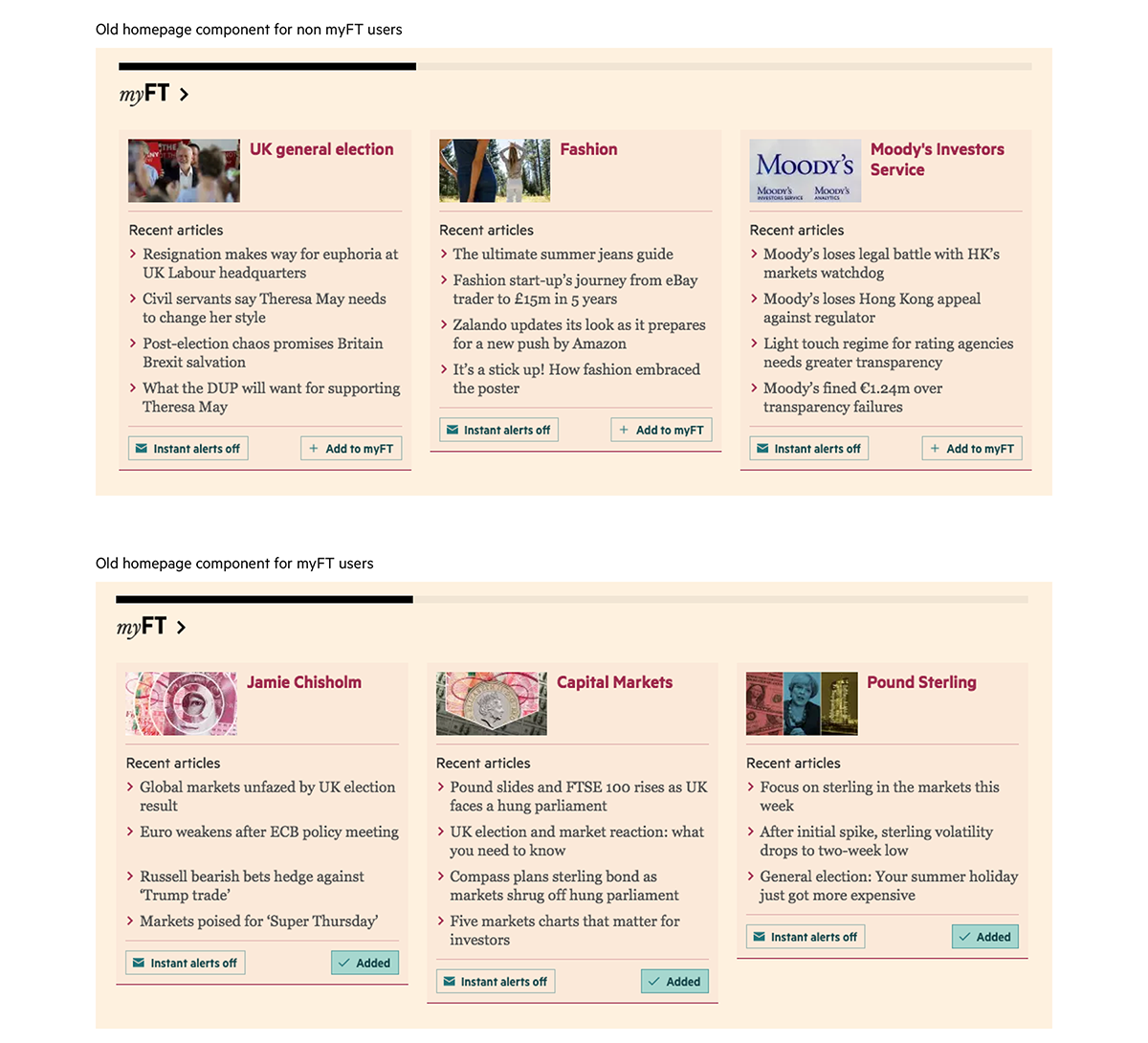
The layout of old myFT homepage component wasn't any different for non myFT users and myFT users.
Business goals
For non myFT users
To grow awareness of myFT through recommended content/topics.
Promote email digest early in the journey.
For myFT users
To make the myFT experience more useful and relevant by giving users more control over what topics appear in this space.
Metrics
For non myFT users
Rate of new topics followed per week from the home page component.
Number of articles read via this component.
For myFT users
Article visits via the home page component.
New topics followed among existing users via that component.
Counted content consumed via home page.
UX and design goals
To refresh UI of myFT homepage component and feed as design is outdated.
To educate users where myFT feed is.
To make onboarding to myFT process simple and easy for non-users and make sure that myFT component still serves well current users.
myFT user needs (derived from NPS feedback)
I want to see more content in myFT homepage component.
I want to see the latest stories on the topics I follow.
I want to have an easier access to myFT on the homepage / I want myFT to be more prominent.
I want myFT to reflect my actual interests.
I want to be able to choose what and how many topics from myFT feed appear on the homepage component.
Process
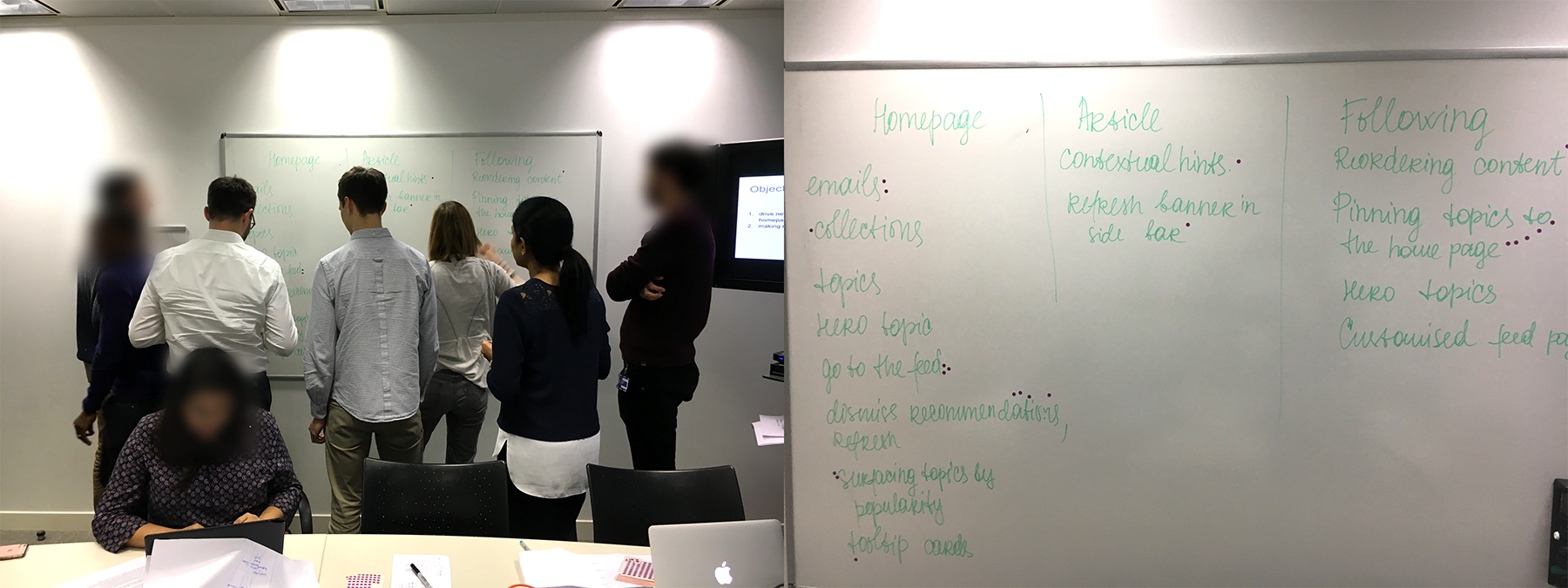
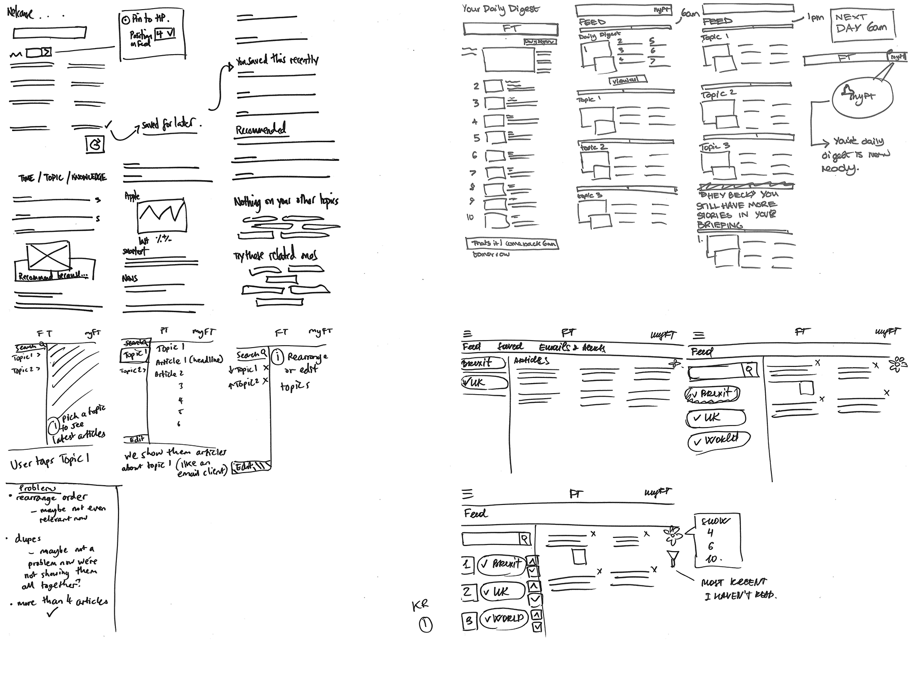
I started with analysing NPS feedback and understanding the trends of the problems. Then I facilitated a design studio with the team
where we came up with 3 different ideas for the layout of myFT page and 2 types of the user journeys.
Design studio session with the team. Dots represent the options that the team voted for to build.
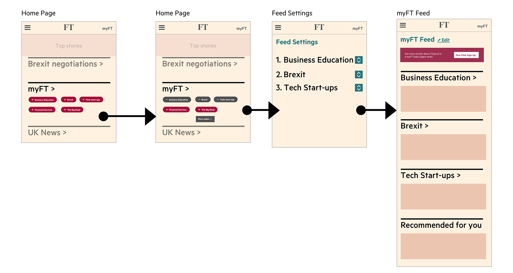
Topic based onboarding stands out well on the homepage. Users are shown top 20 most popular topics to follow > they select one or several topics of interest >
they land on the Feed settings page where they can change the priority order of the articles displayed > they click 'Finish editing' > they land on myFT Feed page with the articles
based on the topics they've selected. Nice and clear.
Prototype with the topic based onboarding.
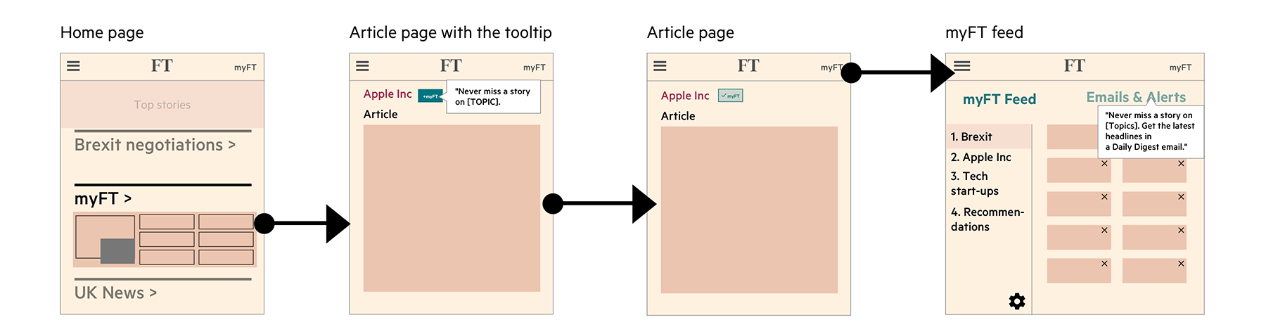
Article based onboarding journey: users are shown the articles based on their previous browsing history > they click on the article of their interest >
they land on the article page > FT.com shows them a tooltip that recommends to follow a topic > user clicks '+Add to myFT' > after following several topics
they click on myFT icon in the top right corner the feed. Last step is the most challenging from user journey perspective: How will users connect adding a topic
and myFT feed? What would motivate them following topics based on reading a single article of interest? How is article based component on the homepage different from other
sections that are also combined from articles?
Prototype with the article based onboarding.
Insights
During second round of qualitative research we’ve spoken to 5 non-myFT users and tested the user journey from myFT homepage component to myFT feed.
We’ve showed them topic based onboarding and article based onboarding, and participants gave much higher rating for the topic based onboarding.
Also 4 out of 5 readers prefered the topic based onboarding to the alternative.
Outcomes
First A/B test was to identify which component performed the best for non myFT users: old topic card layout, article based onboarding or
topic based onboarding. The results showed 22% uplift in CTR of the topic based component in comparison to a control variant.
Article based component showed -1% CTR.
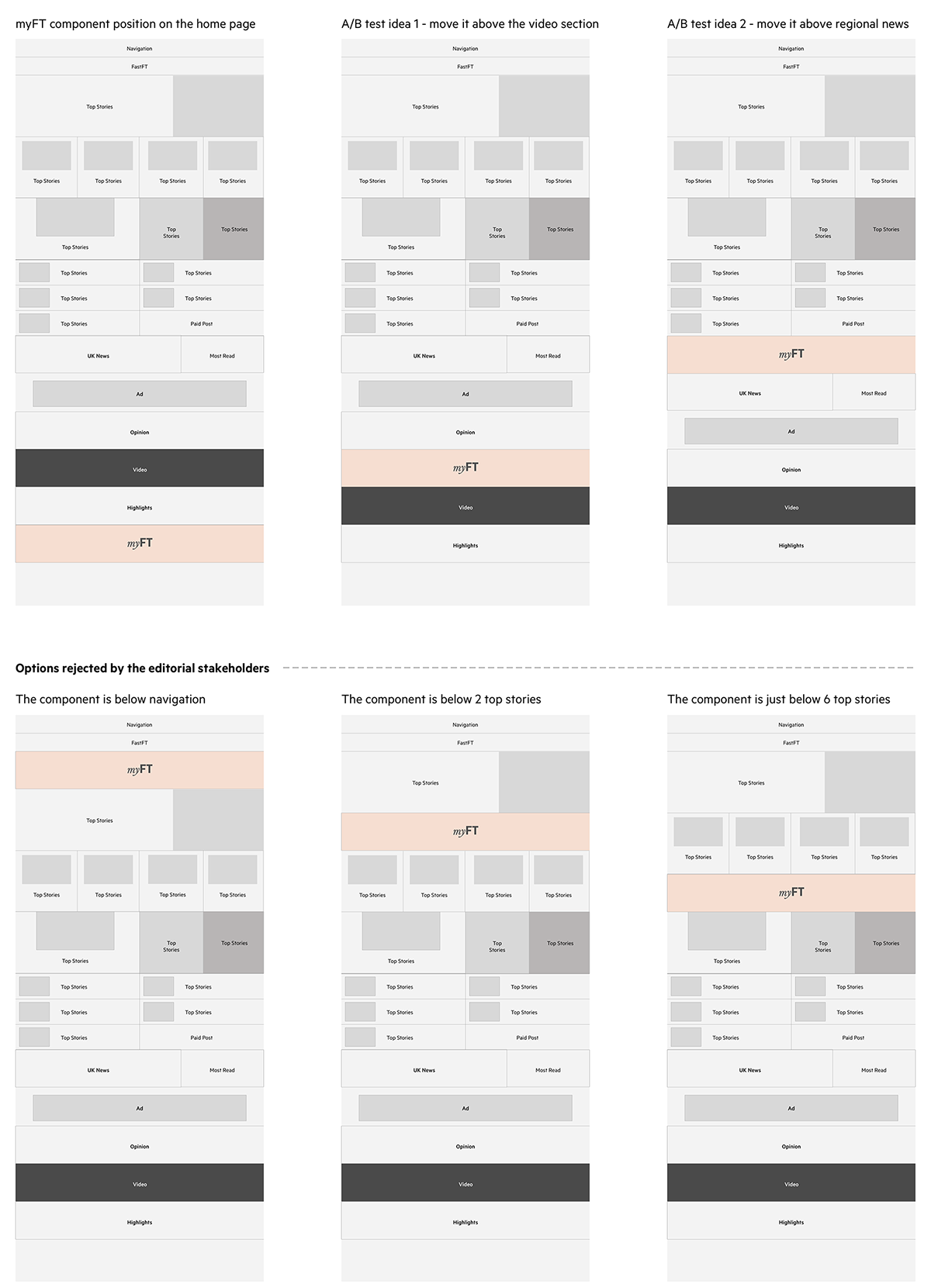
The second A/B test was about changing the position of the myFT component on the homepage. Due to editorial guidance we couldn’t move it
too high but we also needed to move it higher than the video section that has a dark background and was perceived in other tests as a footer
when participants scrolled down the homepage. Swapping the position of the myFT component to a more prominent one resulted in about a 80% uplift.
For existing users they read 60% more articles from that component than the control. There was no detrimental impact on the total number of articles
viewed from that page. However, the higher position of the myFT component caused an average fall in article clicks on stories from the Opinion
component over the test period. So, we've arrived at a compromise and swapped the order of Video and myFT.
Wireframes explore different options of the position of the myFT component on the homepage.
Hypothesis: Because the current myFT feed page has limited control of topics, and doesn’t do much to invite frequent/repeat use, we believe that redesigning it
will make it more of a worthwhile destination, while improving onboarding experience for new users.
Business goals
For non myFT users
To get people following a handful of topics
To get more people opted into the Daily Digest
To provide a better (no effort) experience for people who haven’t followed anything
For myFT users
To increase visit frequency and article referrals from the feed page.
To provide a better (no effort) experience for people who don’t follow many topics.
To deliver an onward journey to associated markets pages.
To get more people opted into the daily digest.
User needs (derived from NPS feedback)
I want to be able to rearrange the order of the topics, filter and sort topics in myFT feed.
I want to see relevant recommendations in myFT and I don’t want to see old content, irrelevant recommendations
and duplications in myFT feed.
I want to see more than 4 articles on each topic.
I want to see other types of content in myFT (comments, videos, special reports, commodities, markets data).
Process
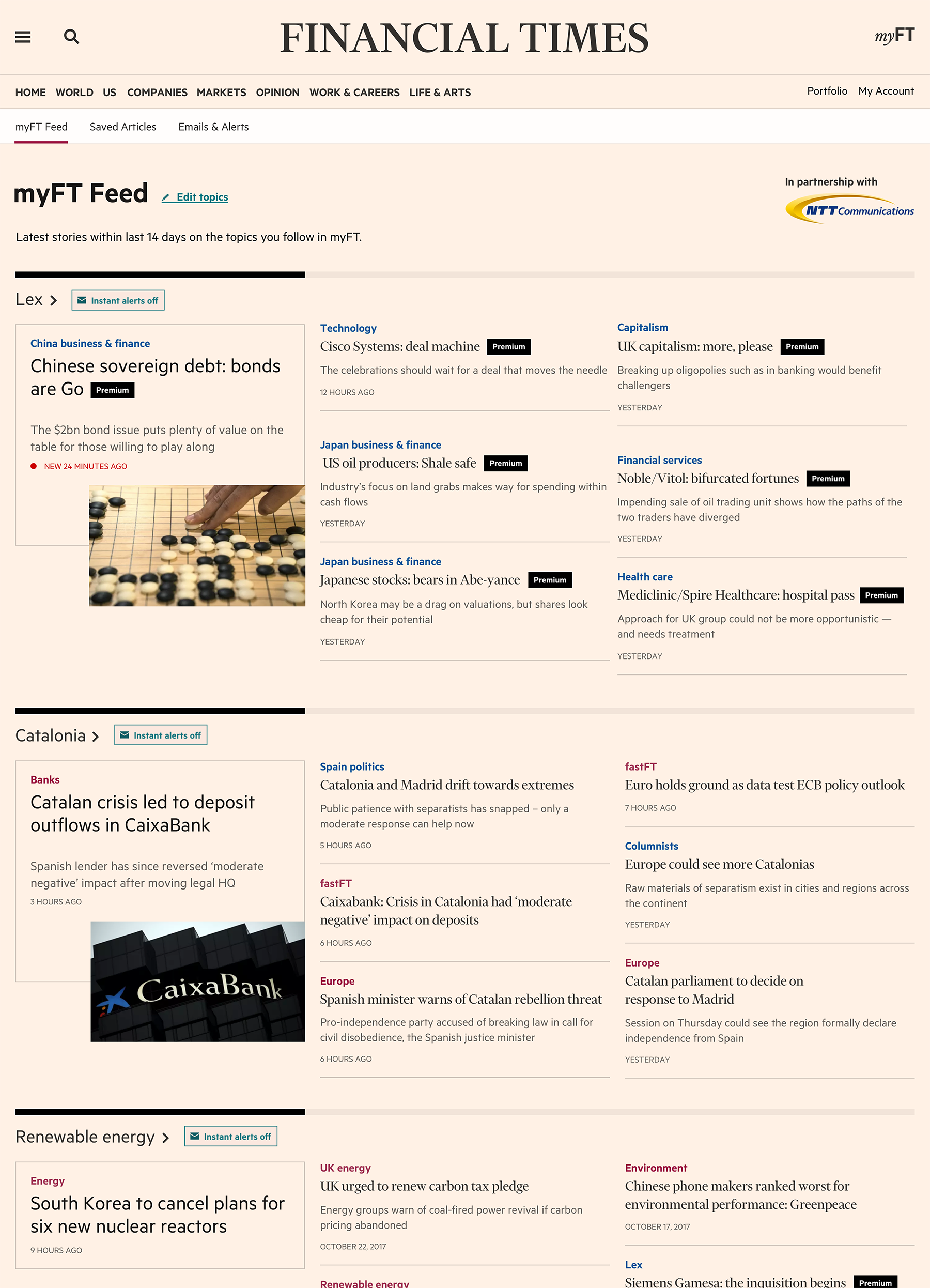
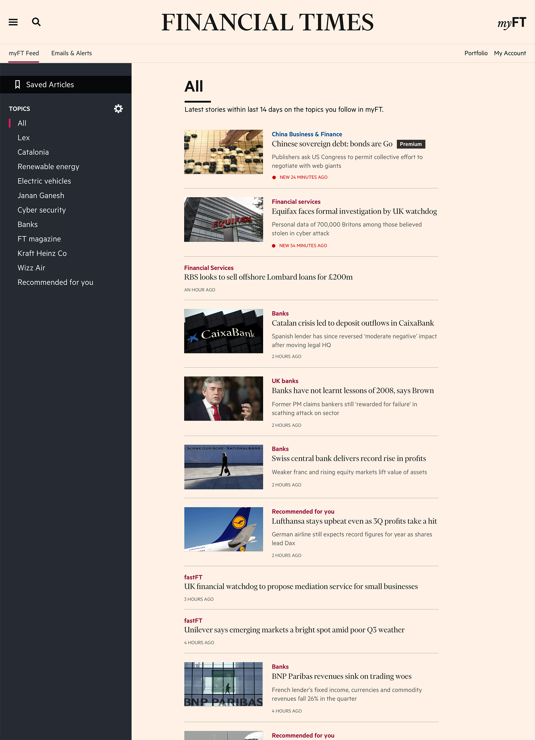
Old myFT feed page.
I facilitated a design studio session, and the team came up with several fresh ideas for the feed page.
Skecthes that came out of the design studio session.
Redesign of the FT.com homepage resulted into creating a new article component called ‘teaser’. The home page started having groups of teasers that had different configurations. You could have an image, a datestamp, a headline, a byline, an icon in one teaser depending on its purposes,
and there were different styles of the teasers with different backgrounds. For example, a teaser in the opinion section has a blue image and blue background if it appeared in the top stories higher up.
We thought we can repurpose the teasers and use them in the feed page for myFT users who were asking to see more articles per topic.
So I’ve created several prototypes that had teasers as well as the sorting functionality allowing to sort the articles by topic, the
latest or the oldest.
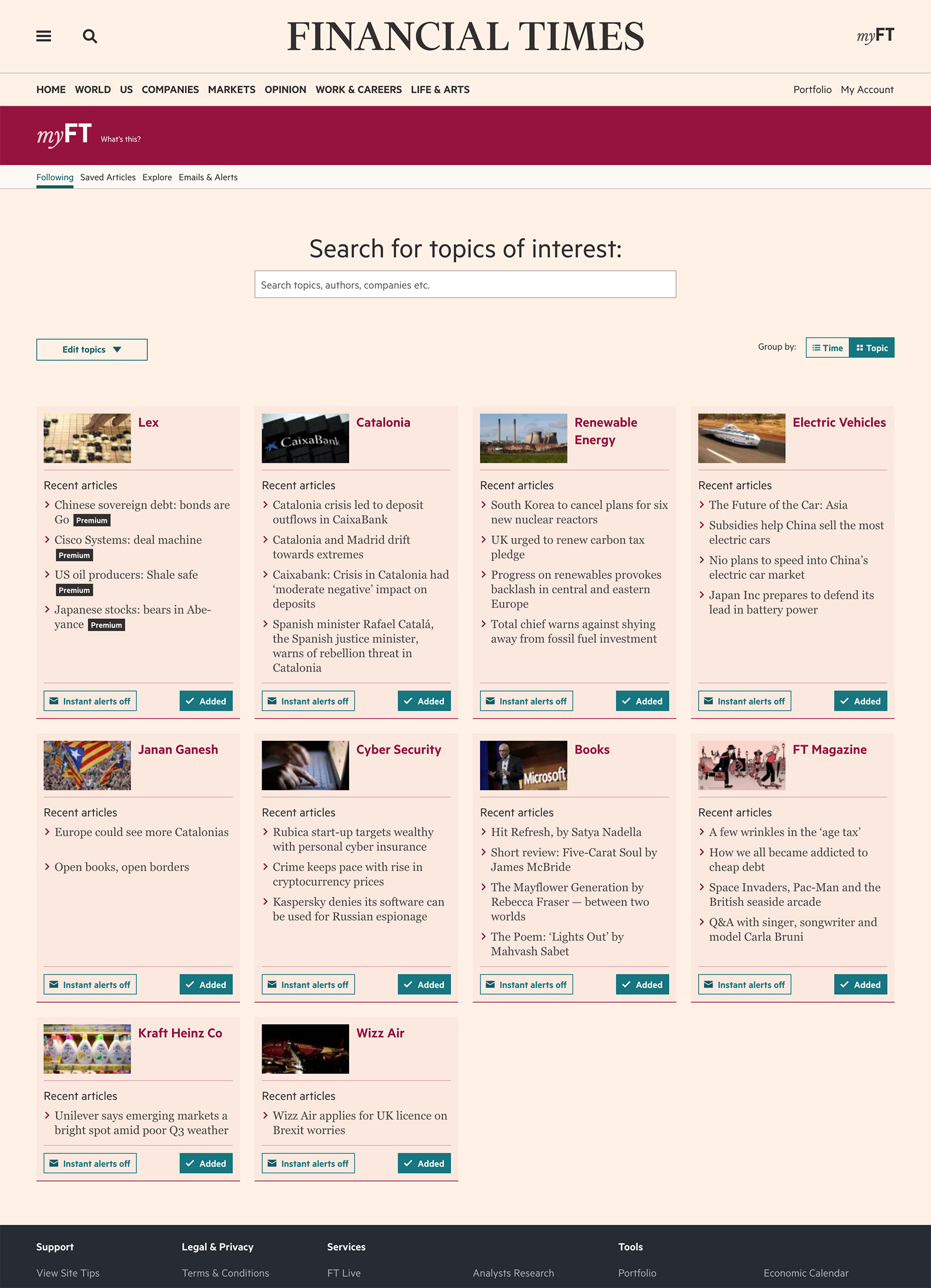
myFT feed page with the teaser collection .
myFT feed page with the left hand column to navigate the content. UI design by Rebecca Turner.
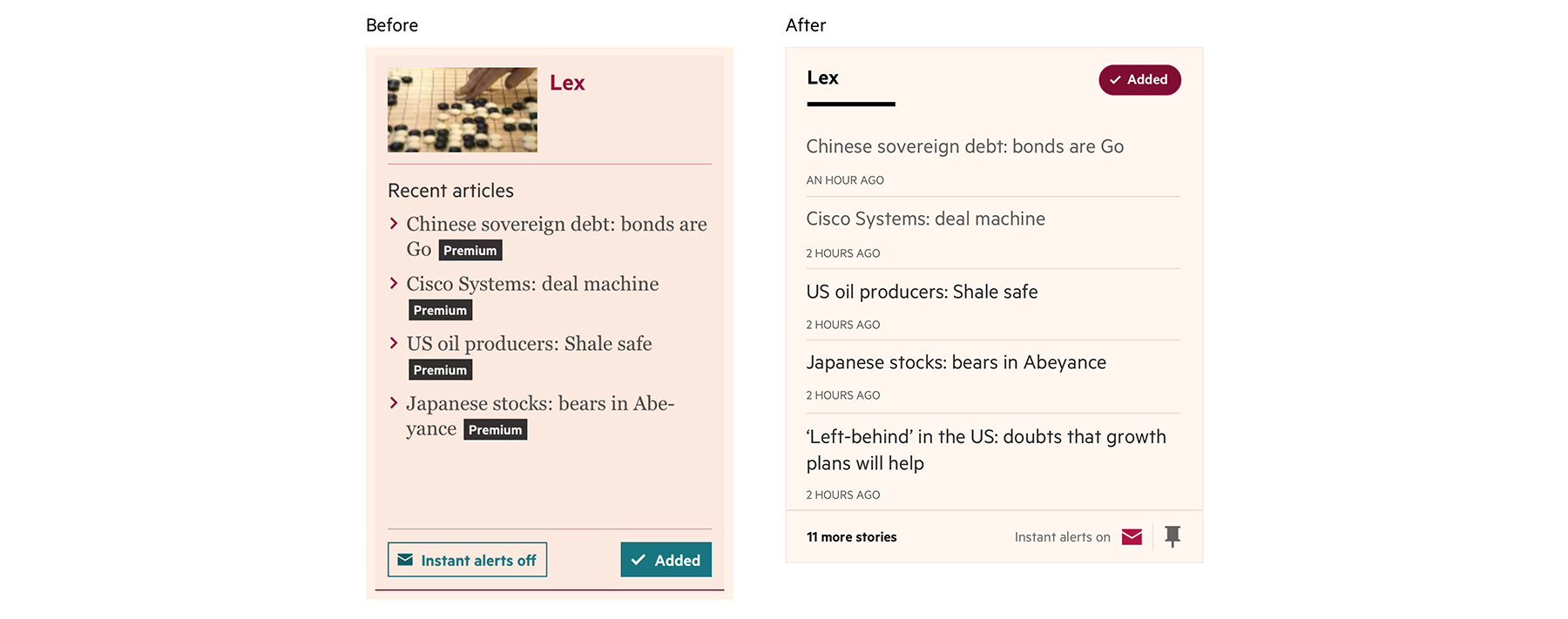
During usability testing sessions we’ve learnt that readers actually preferred the card format of the topic and didn’t
find the teaser collection really useful. Although it had more information and more articles, they couldn’t get a quick overview of topics
for that day. Based on these findings we’ve only optimised a card design and have added one more article per topic which was quite easy to
implement and run an A/B test.
Outcomes
New design of the topic card with an extra article on myFT feed page performed well in A/B test showing 10% uplift in comparison to
the control variant.
Card design on the myFT feed page before and after. UI design by Rebecca Turner.
Business goals
Increase subscriptions of myFT Daily and Weekly digests.
Increase CTR on the article links.
User needs (derived from NPS feedback)
I want to receive minimum amount of the emails with the maximum value.
I want to see all the stories on the topics I follow in myFT Daily Digest so I don’t have to go to the web-site to see more headlines.
I want to have a clear way to manage myFT emails.
NPS feedback
Other NPS comments highlighted a problem of users who have the app: they clicked on the article link in the digest and it didn’t open the link directly in the app but went onto FT.com and asked them to log in. Additionally, customers mentioned a wide variety of newsletters and that the content they got from myFT Digest and some newsletters was duplicated. These were much bigger problems outside of the scope of this initiative, although the feedback was passed onto the corresponding teams.
Process
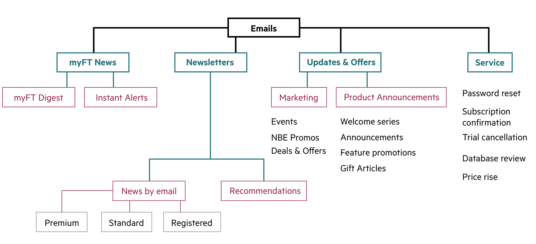
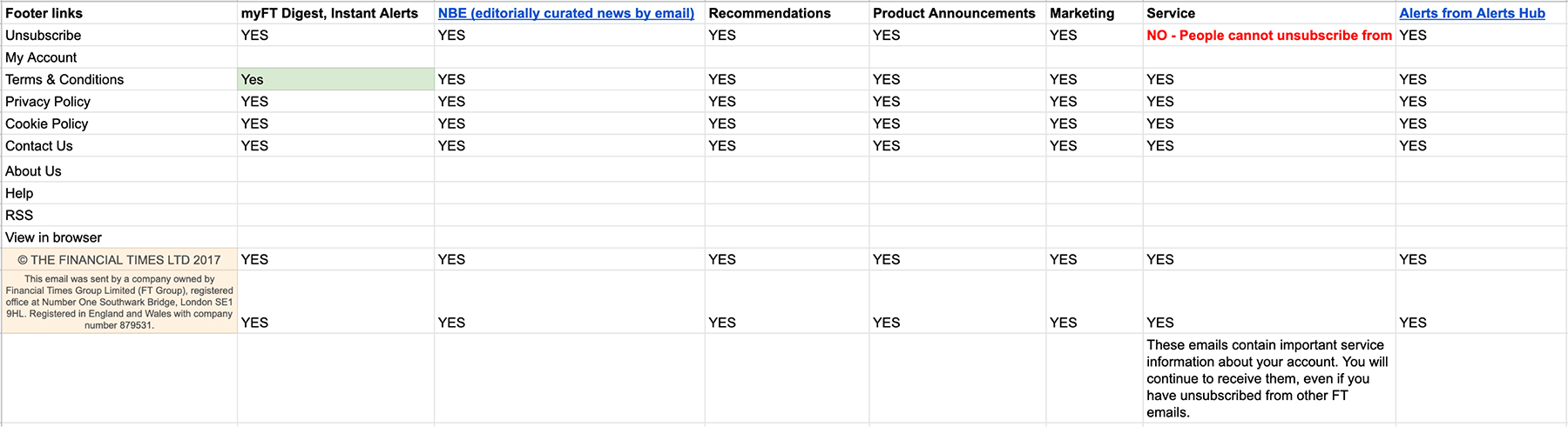
I started with analysing NPS feedback and trying to understand what issues FT readers had with the current digest (apart from its outdated design). In parallel, I had a look at all other newsletters, printed them and put them on the wall. I analysed the footer links in different types of emails FT readers were receiving, and I also created a diagram of what emails B2C and B2B customers were getting.
Hierarchy of emails for B2C users.
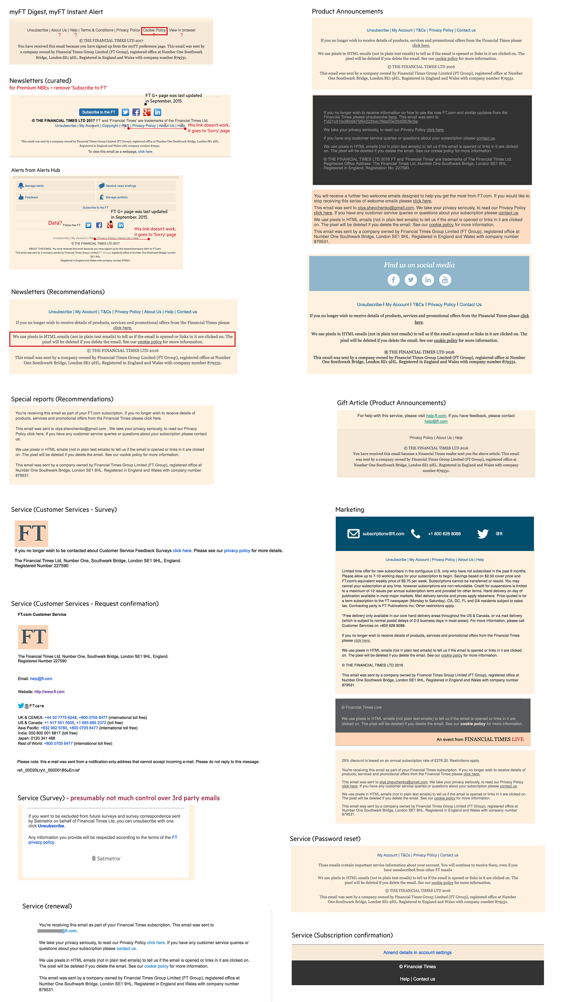
Analysis of the footers all types of emails users get from the FT.
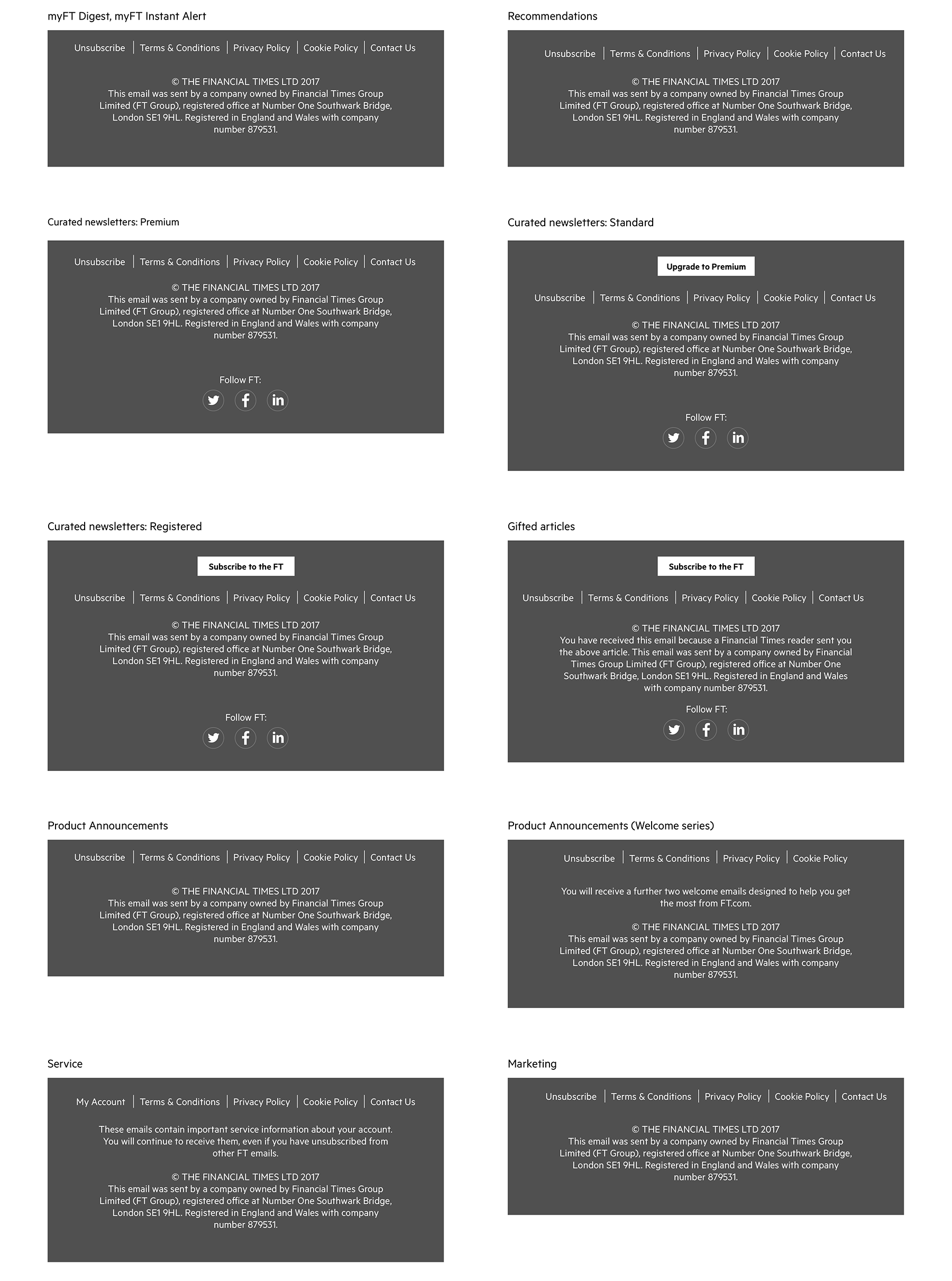
Footer wireframes per each footer type.
Compliance team checked and confirmed which links have to be in every type of email.
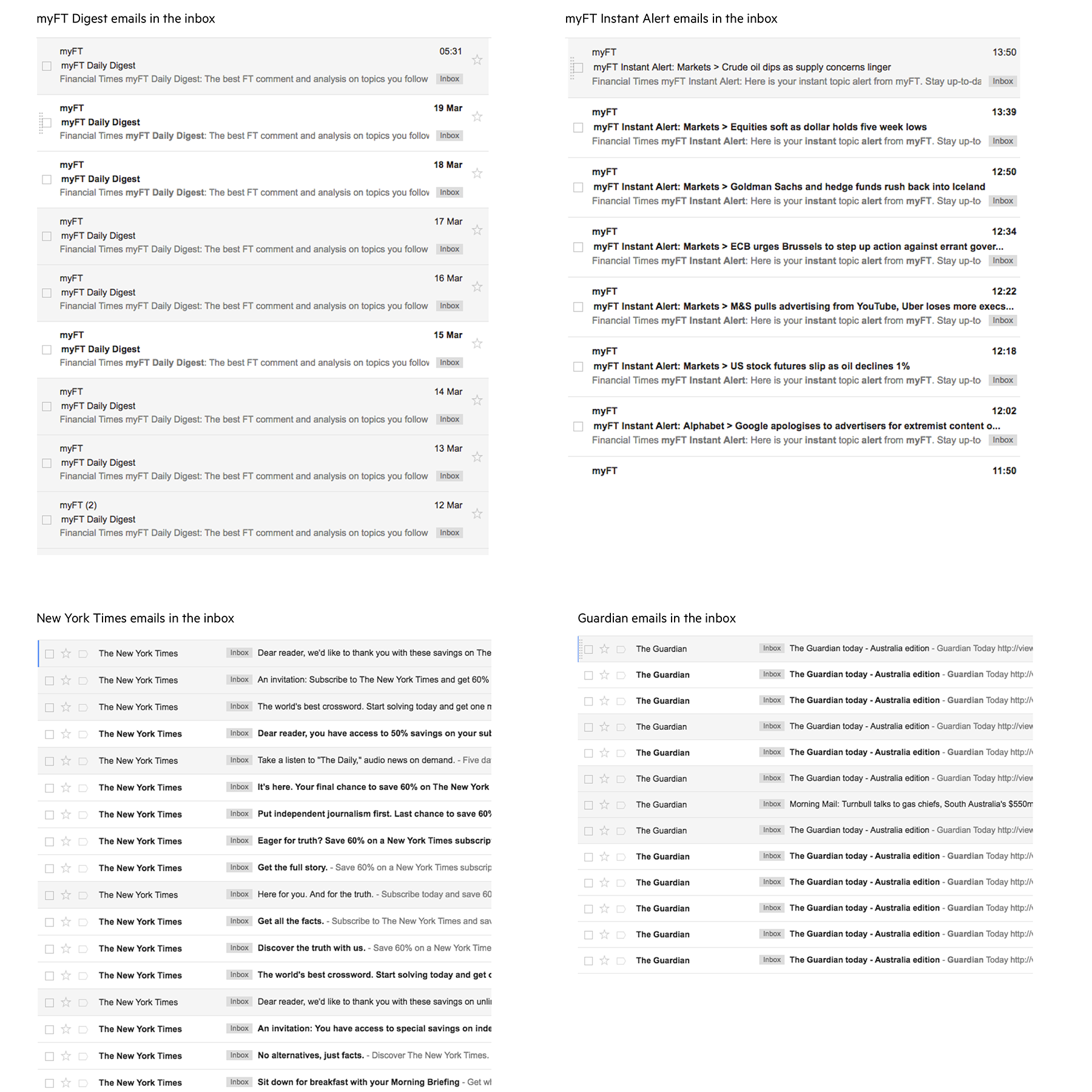
I have done a UX analysis of the subject line and how email appeared in the inbox of the users. All the emails were called myFT Digest or myFT Instant Alert (a reader would get this email in case they
wanted to be instantly alerted via email on a specific topic) and from the subject line, they didn’t really stand out in the email list and appeal to the reader.
myFT emails didn't stand out for users in the inbox in comparison to the New York Times or Guardian emails as the subject was the same and repetitive.
It didn't give readers a sense what was happening in the news that day.
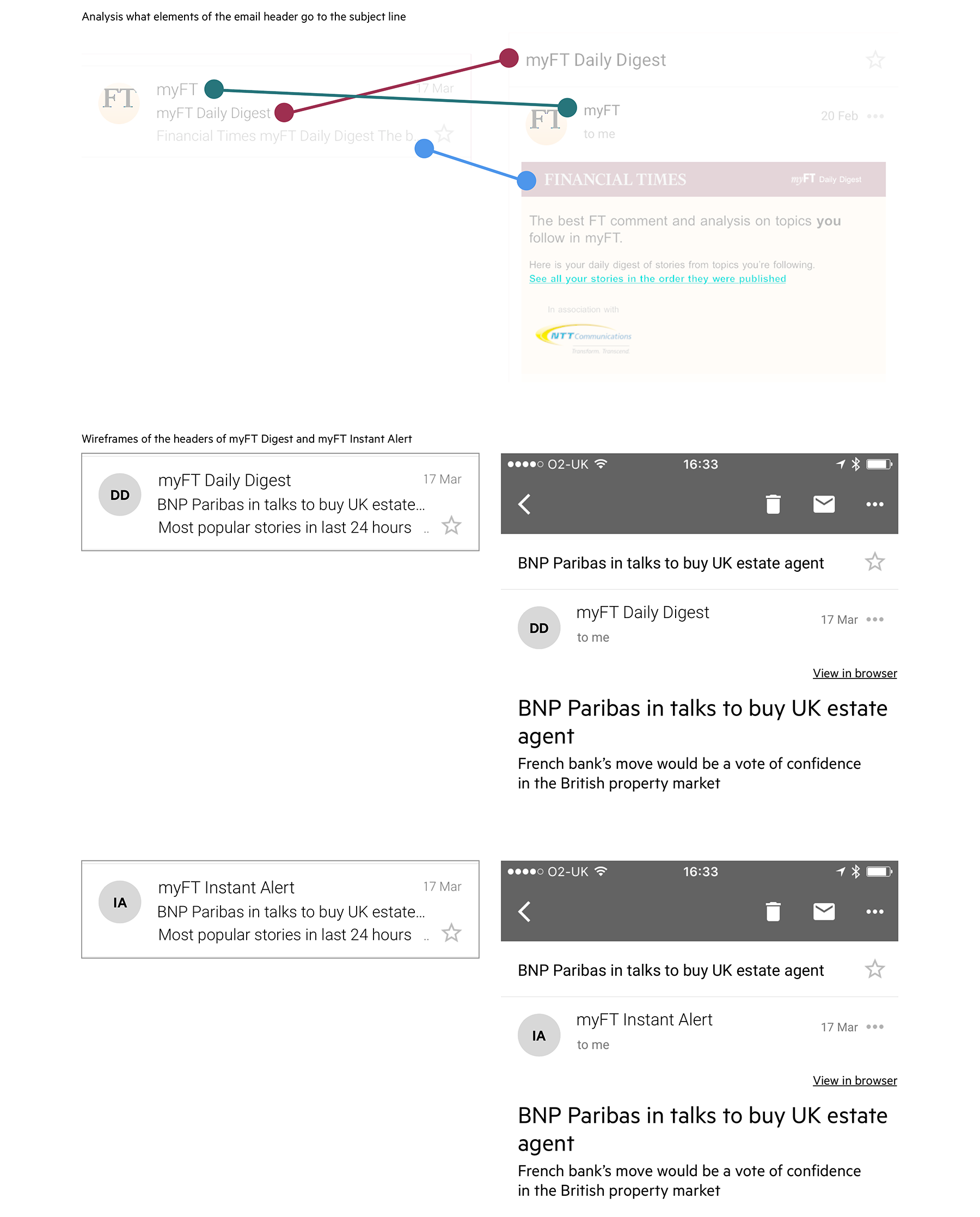
Anatomy analysis of what elements of the email go into the inbox and suggested improvements.
Then I created a wireframe of a simplified version of new Digest email, and worked with UI designer to make sure that key experience elements were not lost.
I then spoke to the Customer Research Team, and they recommended to run a survey as we will get a lot of responses to validate new designs.
Survey
There were ~700 responses in total, mixed feedback from B2C and B2B users.
Survey results by objective:
1. To explore current habits around the current myFT digest email
Respondents have a strong habit with their current digest email. Overall more than a half of respondents are reading every day B2C subscribers are likely to follow more topics, journalists or sections than B2B subs.
The current email digest is valued highly among recipients.
2. To measure reader reaction to a new design for the myFT digest email
The new design was perceived as less valuable.
3. To discover what are the users’ preferences in terms of images in the digest
Images are divisive. ~60% of respondents would be happy with some images. ~30% do not want any images.
4. To understand whether they want to receive the stories grouped by topics or in chronological order
More than 75% of respondents would like the myFT digest email articles grouped by topic.
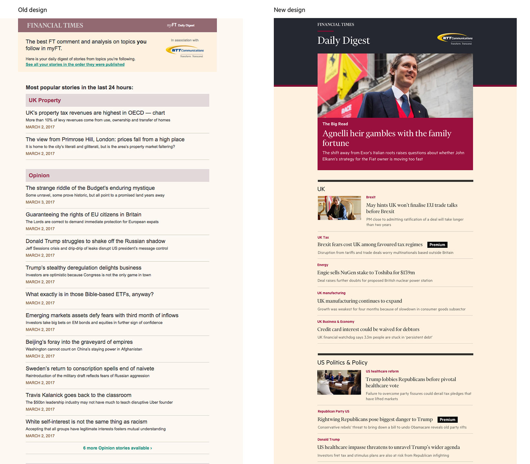
Old and new designs sent as links in the survey to the readership panel. UI design was done by Rebecca Turner.
What works well with the current design?
I like Daily Digest as it saves my time.
I am not afraid to miss stories on important topics.
Daily Digest is a reminder on what I need to read today.
What to improve?
I don’t have time to read your Daily Digest.
In the digest I see the content which I already consumed on ft.com or from newsletters.
I’d like to see all the headlines on all the topics I follow in the email and I don’t want to click externally.
What works well with new design?
I like new design as it is clean, clear and easy to scan and read.
I like that the main story attracts and hold attention with the picture.
New design is visually appealing and the colours are vibrant.
I can click on the topic header I like new layout.
What to improve?
I’d like the content to be grouped by topics / sectors.
I don’t want any images in the digest.
New design is visually appealing and the colours are vibrant.
I’d like a smaller image at the top.
I’d like new design to be mobile friendly.
I’d like to see more images, charts and graphics in the digest.
I’d like to see a larger summary under the headline I’d like a bigger font for heading.
Redesign
Feedback from survey informed redesign of the email:
1. We’ve implemented one large image at the top and smaller image at the top story of each topic;
2. Articles were still grouped per topic and not displayed in chronological order;
3. As the feedback on design was positive, we didn’t do any other changes.
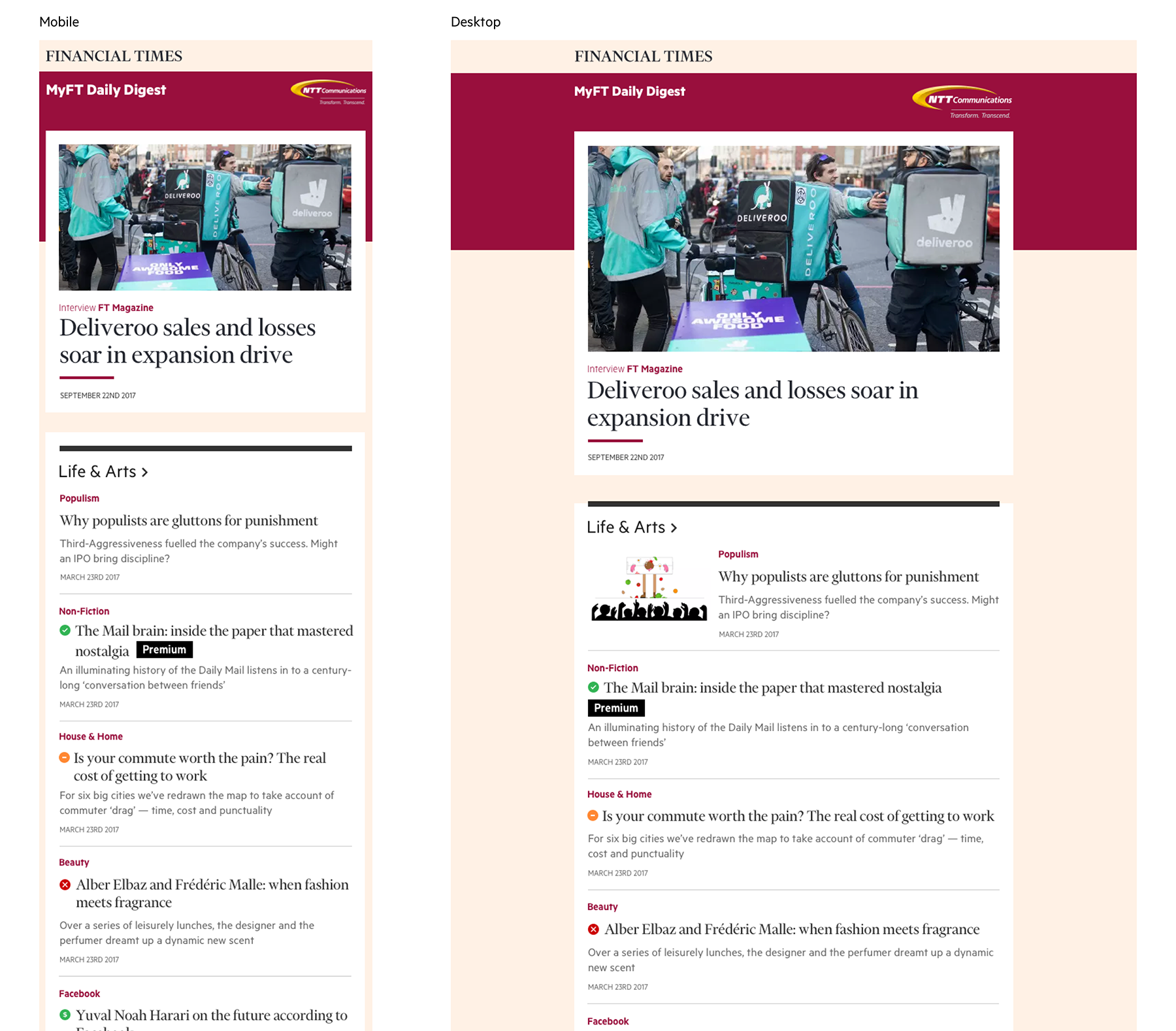
New mobile-friendly design of the myFT Digest email. UI design was done by Rebecca Turner.
Outcomes
Both the open and CTR were improved by the redesign. The open rate went up by 5% vs. the control, and the CTR went up by 10%.