Process
FT came onboard as trusted testers and proactively influenced development of the product. The team had weekly meetings with the Google team which was dialling in from across the US. The dedicated teams from the FT and Google were on the journey together exploring edge cases and different scenarios. For example, Google supports payments in local currencies in 137 countries while FT only supports 6 currencies which are local in 36 countries. Google allowed us to run user research activities, and I facilitated guerilla usability testing in the coffee shops. Myself and a product owner brought the insights back to Google, and some of the learnings influenced the design and user experience of the product.
The challenges were around identifying MVP, edge case scenarios (as Google only presented "a happy path" user journey), user research and understanding what team works on what part of the journey from Google or FT side.
The project had 3 big chunks of work: building 'Sign in with Google' (FT.com didn't have any social login prior to this initiative), building subscription flow and building linking accounts. I was involved in the first 2 stages of work.
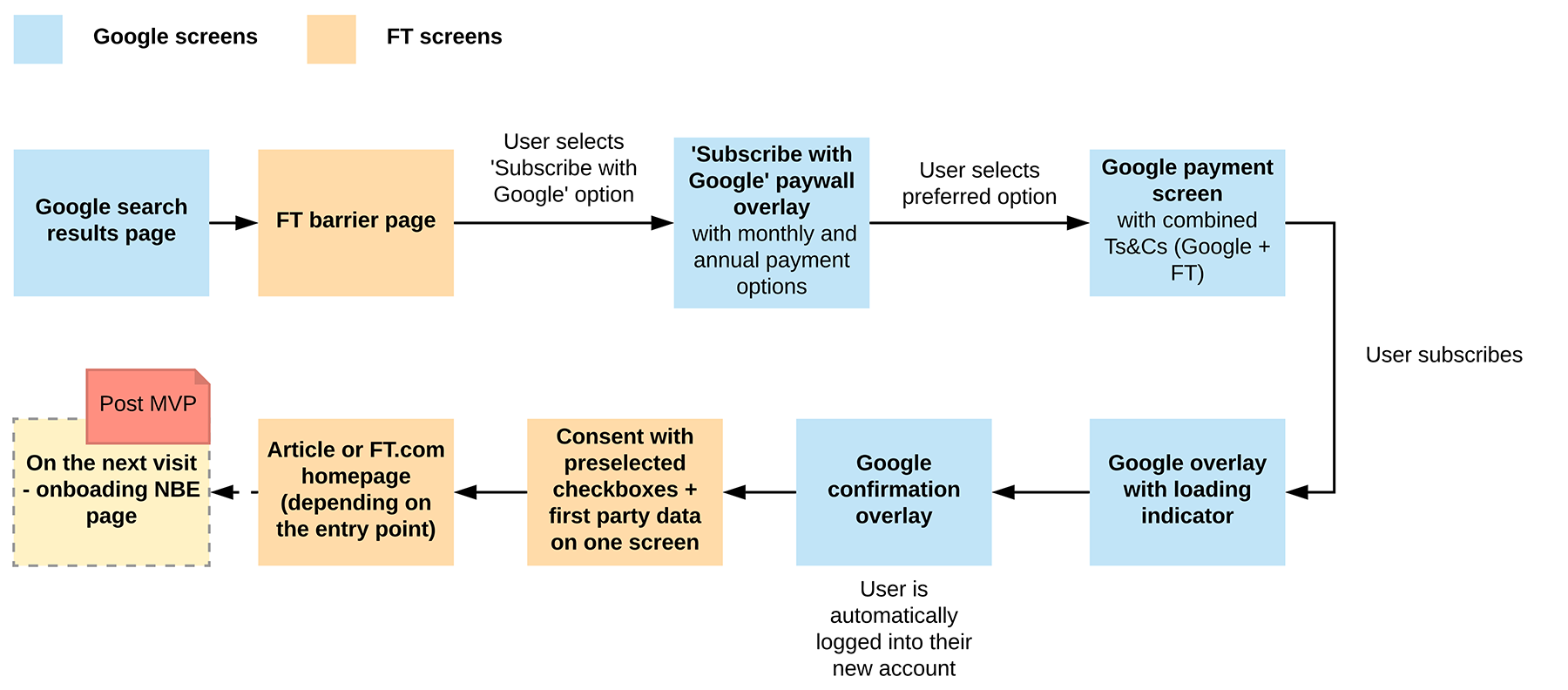
As a user experience designer in collaboration with the tech leads from several teams, I produced onsite and offsite user journeys so it was easier for us to decide what went into MVP, want went to the A/B testing and what was left for post-launch.
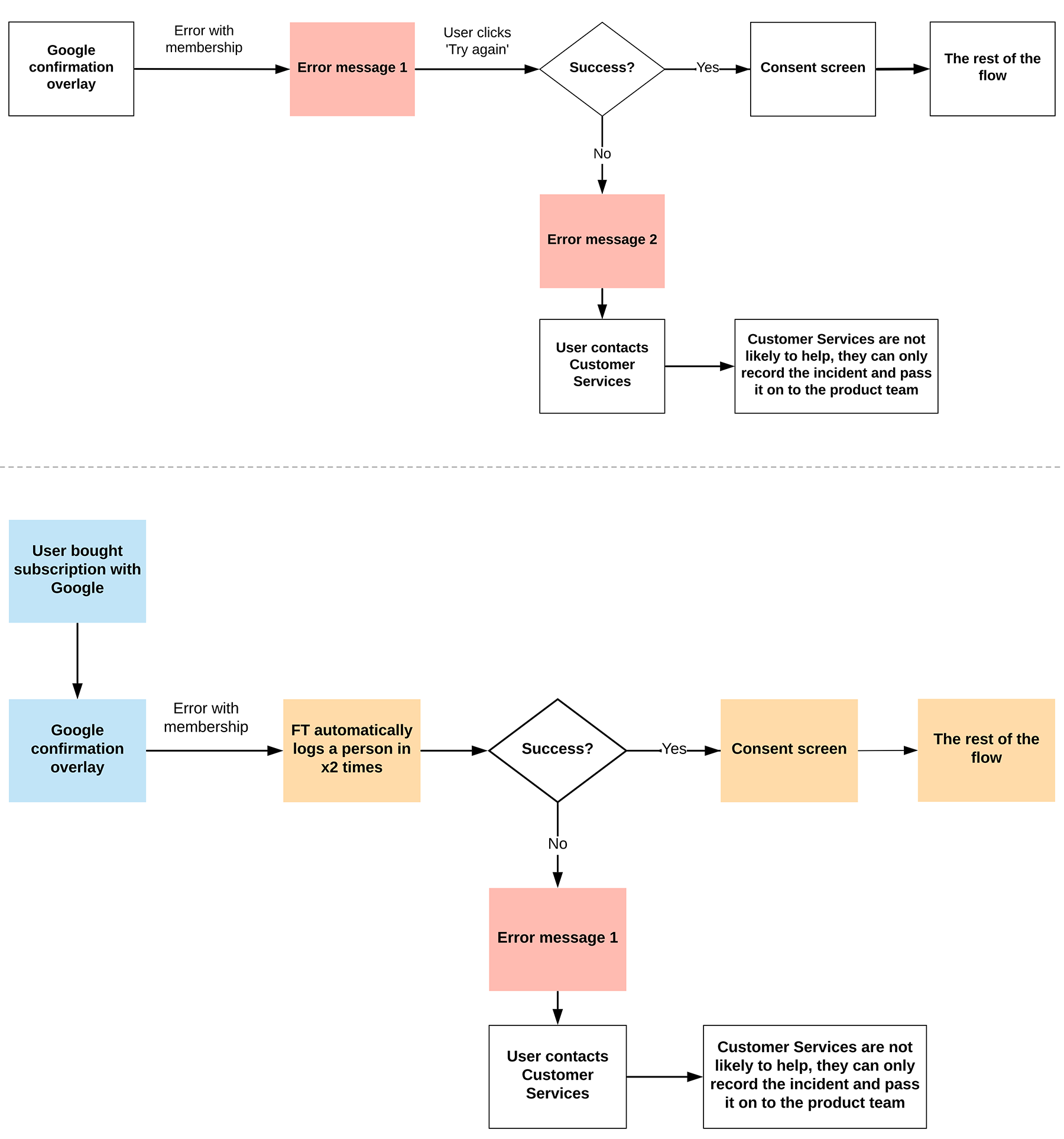
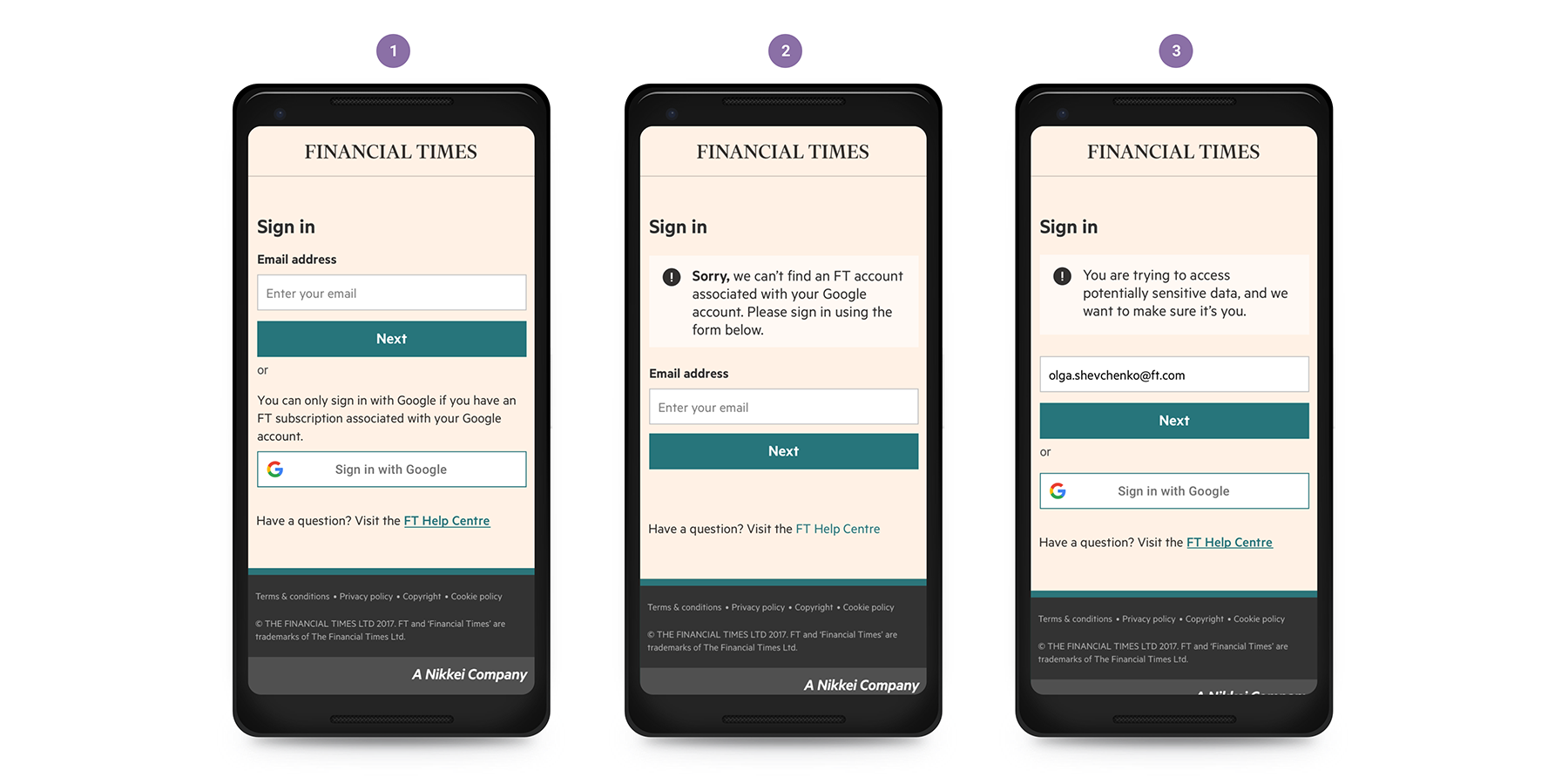
A product decision was to allow using 'Sign in with Google' feature to the FT subscribers and not just anyone who has a Google account. I needed to think about how to communicate that on the log in page as well as about a user journey and error messaging for those who happened to have an FT subscription with their Google account but for some reason had other Google accounts and mixed them up. At this stage I did usability testing with the FT colleagues in the building who didn't have any information to the project, and to remove any connection to the FT.com as a digital product (as it could bias the responses), I created a prototype shown below just to bring the focus on the journey and the message.
After several usability testing sessions in the coffeeshop together with the designers who worked on the FT apps I landed on the journey that worked well and improved the copy in collaboration with the copywriter that was clear enough to people to get through.
2. System message in scenario when a user clicked on 'Sign in with Google' and FT.com doesn't recognise an email address in the subscribers' database;
3. System message that is shown after 30 minutes of inactivity of the user when they try to access 'My account' section.
The second part of work was to design and build the subscription flow. A lot of functionality was already provided by Google so FT engineers just needed to integrate it with the internal FT systems.
From my side, I needed to make sure that the journey felt smooth for the users when they transitioned from the Google screens to the FT screens. Google allowed us to run our own research initiatives
outside the FT offices so I and the product manager on the team went out to do the coffeeshop testing.
When we interviewed users we were trying to find answers to the questions:
- When people see Google payment screen, do they understand whose policies they are accepting?
- Do they know what organisation to contact if they have problems with their subscription or if they want to cancel?
- Where is the optimal point to surface GDPR consent? (is it straight away after the payment screen or at a later point of the journey - i.e. next visit)
- How will people react to error messages on their sign in journey both on mobile web and in the app? Will they understand the message?
- What will they do to complete the task of signing in?
One of the findings was that the majority of participants were not familiar with the brand GPay, were not sure if it was Google Pay or something else, imagined GPay being only in-app feature and therefore wouldn’t choose ‘Subscribe with GPay’ option. We shared what we have learnt with Google, and they provided the new clearer design of their CTA.
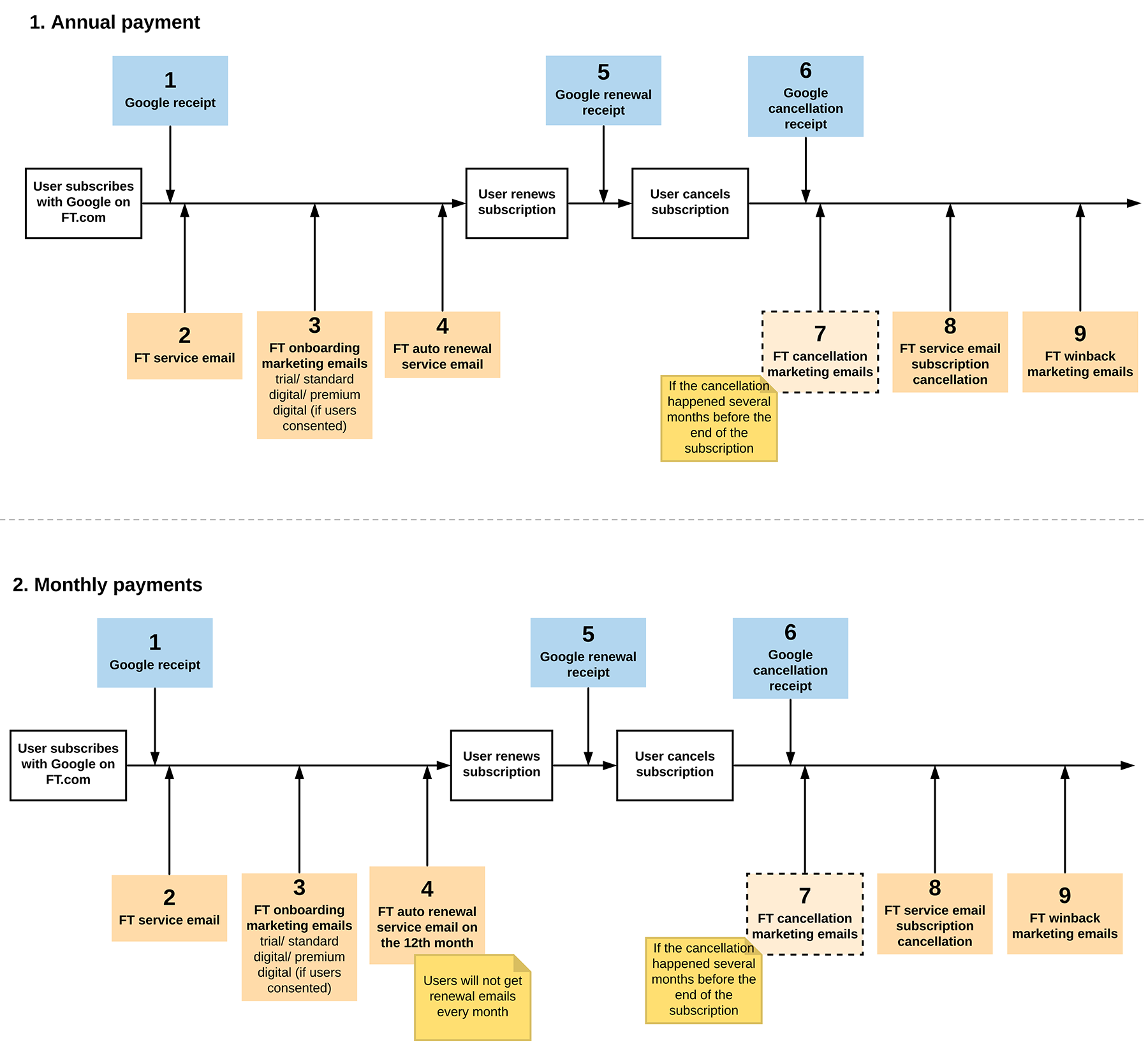
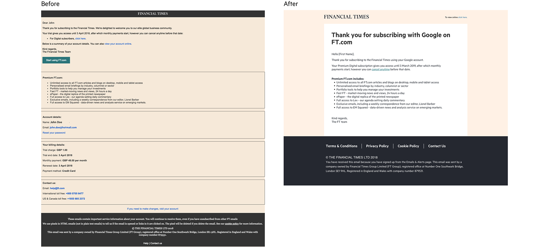
As part of this initiative we've also redesigned and implemented FT confirmation service emails.