Team
Product owner, business analyst, product designer, delivery lead, tech lead, 5 engineers.
Please note that the data represented in the designs is not real. All the names and contact details were generated by uinames.com and company names are taken from the list of largest European companies by revenue on Wikipedia .
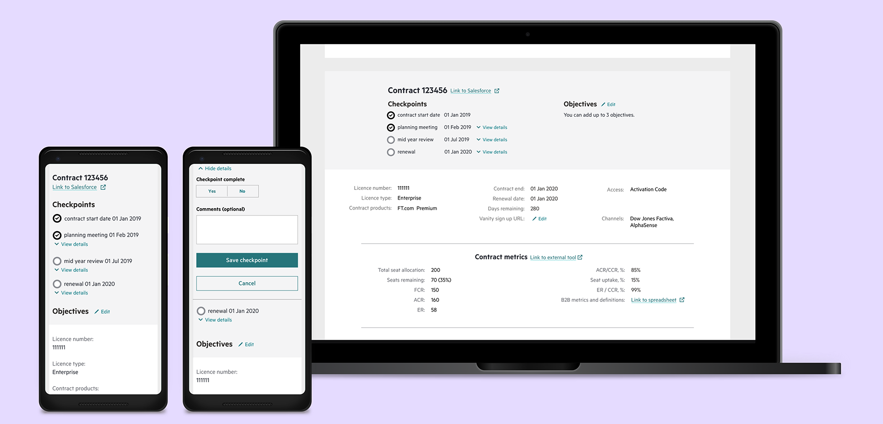
Increase B2B profit contribution by increasing productivity
(efficiency + effectiveness) in account management.
I want to have a clear overview of the account with 16 metrics without collecting data manually so that I can assess the risk and identify what strategy to adopt for this account.
Product owner, business analyst, product designer, delivery lead, tech lead, 5 engineers.
- Mapping user journeys and edge cases;
- Wireframing;
- Prototyping;
- Information architecture;
- User research (surveys, remote and in person usability testing sessions, contextual inquiry);
- UX copy;
- Product design;
- Interaction design;
- Facilitating design studios with the stakeholders and the team;
- Contributing to the roadmap and influencing it;
- Stakeholder management.

Alignment inside the team plays a vital part.
The process that worked very well for this project is the following: Every Monday a business analyst, a product owner and a product designer catch up for 30 minutes to discuss our priorities for the next week; on Tuesday a tech lead, a business analyst, a product manager and a product designer catch up for a 30 minute pre-planning session to go through the tickets that need to be put forward into the planning session on Thursday; on Thursday the whole team has an hour long planning session to go through the tickets and discuss them in more detail. The team can challenge any ticket and if there are not enough details, it will not be moved into ‘To Do’ list. Without pre-planning this session in the past we would spend 30 minutes discussing just one ticket, simply because we couldn’t agree on priorities. You can think: “Oh, it sounds like a mini waterfall process!”, and you might be right but there are no right or wrong answers when it comes to what process would work best with the talent you have in your own team.

I spent about 12 months working on this project, and when I joined the team all discovery has been done by a different UXer. My task was to help the team start building a tool so I facilitated a design studio which is my favourite technique of alignment within the teams and with the stakeholders.
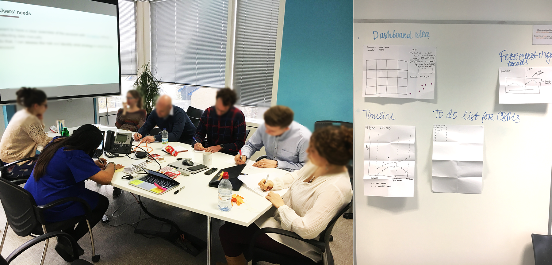
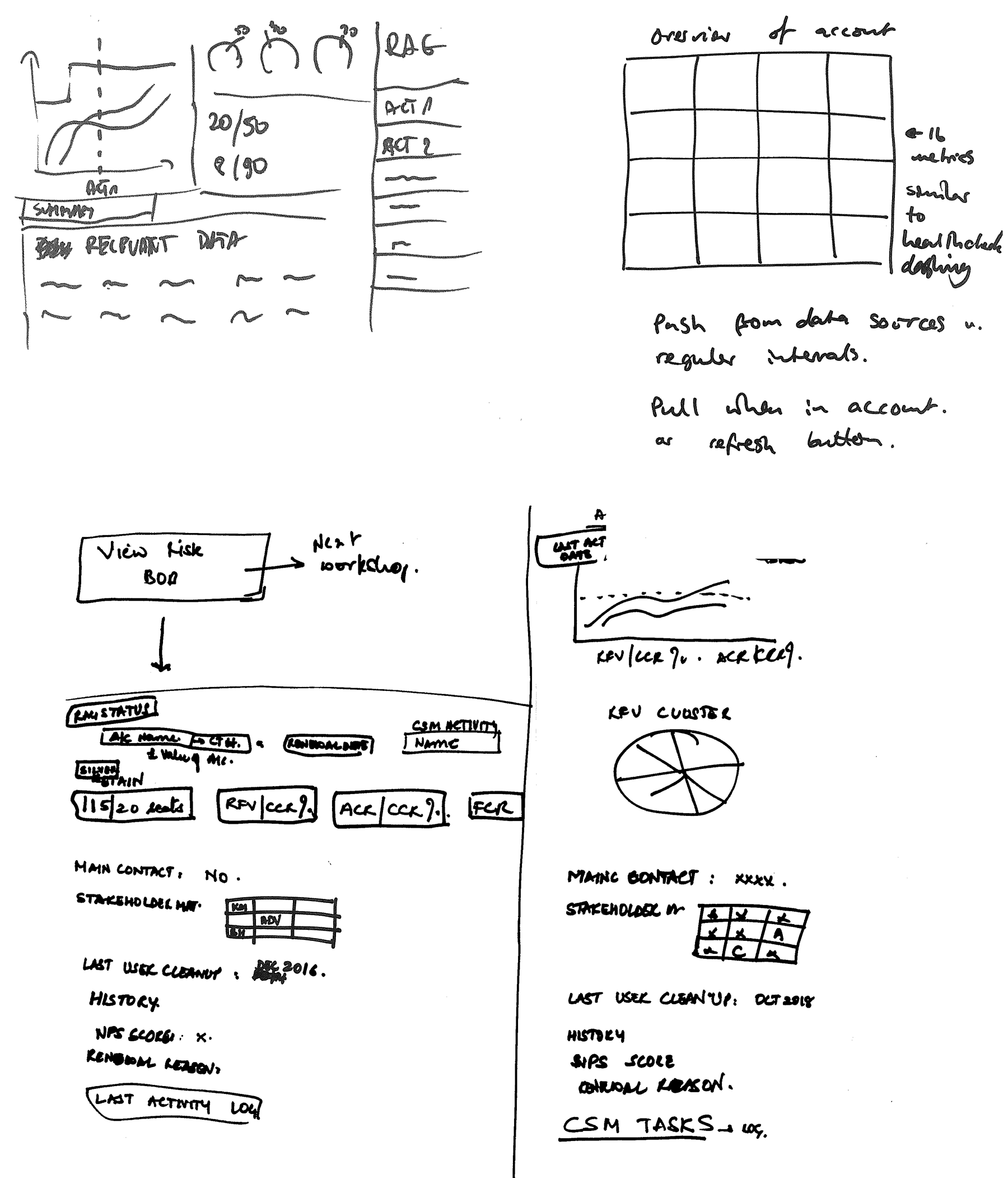
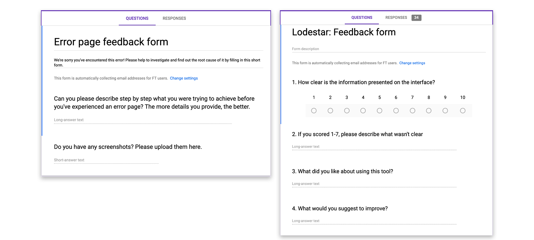
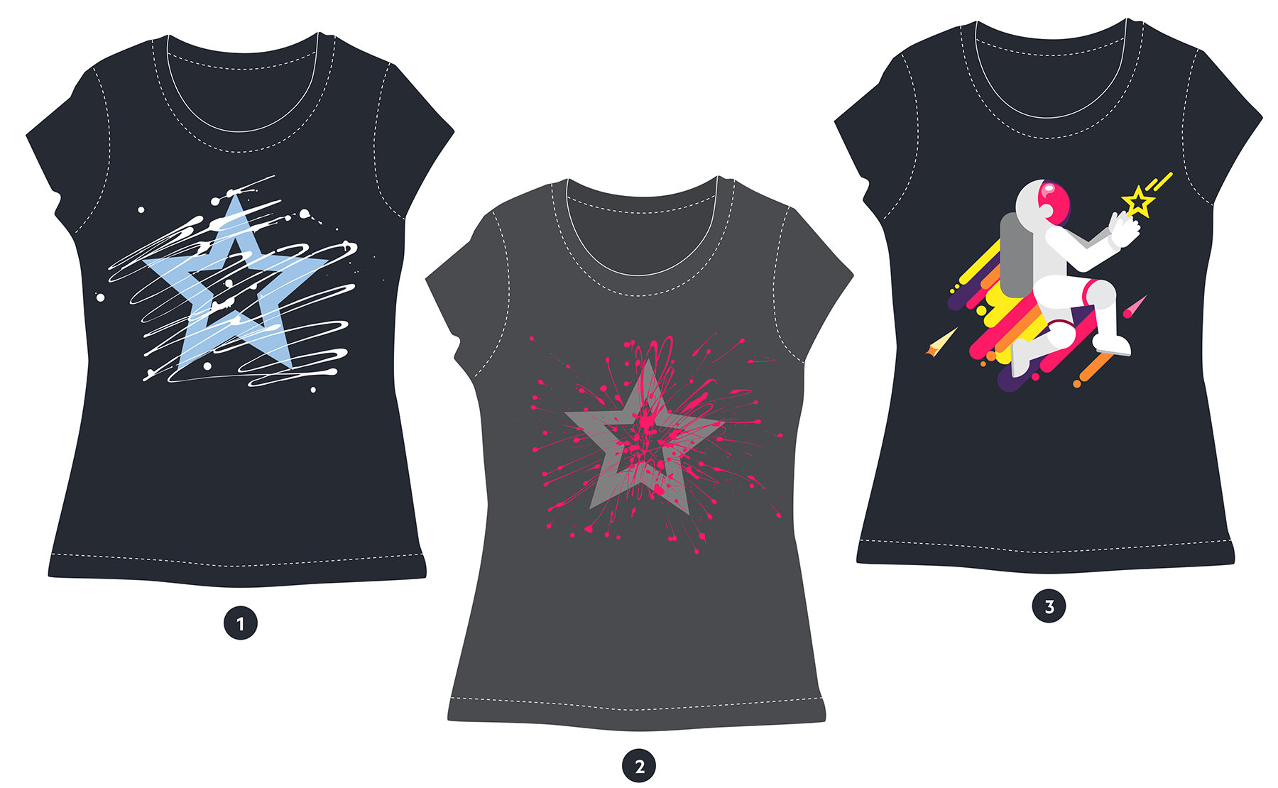
Design studio informed an MVP, and then we did beta testing for around 12 weeks sending weekly emails to the CSMs asking for their feedback and rewarding every response with the ticket for the prize draw. Our team had to think about prize that would work for teams in the US and Asia as well as the team in the UK. I designed T-shirts and bags to give away to our stakeholders to the participants who won in the draw.

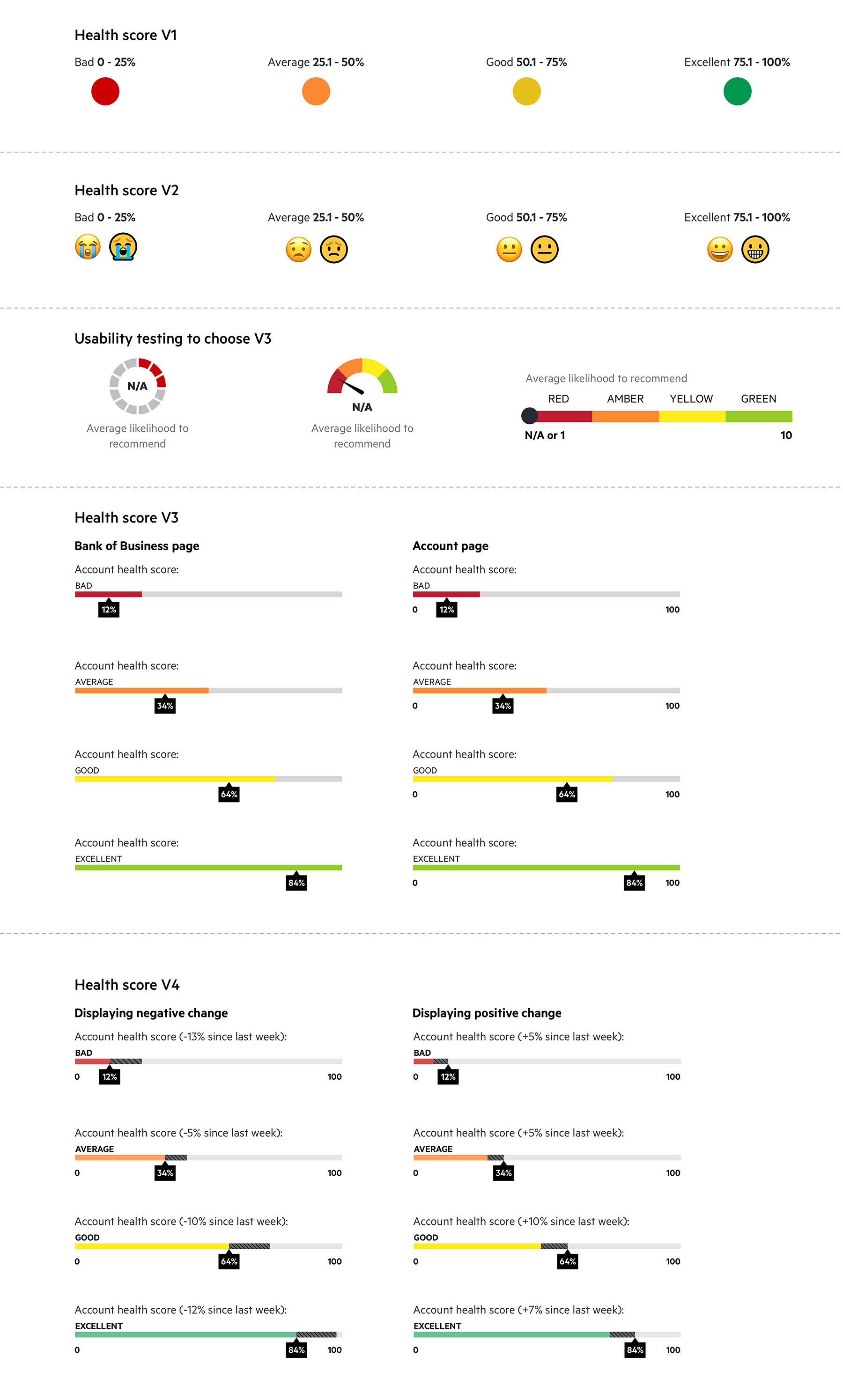
In parallel we ran usability testing sessions, and till the end of the year we’ve had 4 of them having interviewed 6 participants from every region for each session. Below you can see 4 iterations of the health score indicator that represents the health of the account.
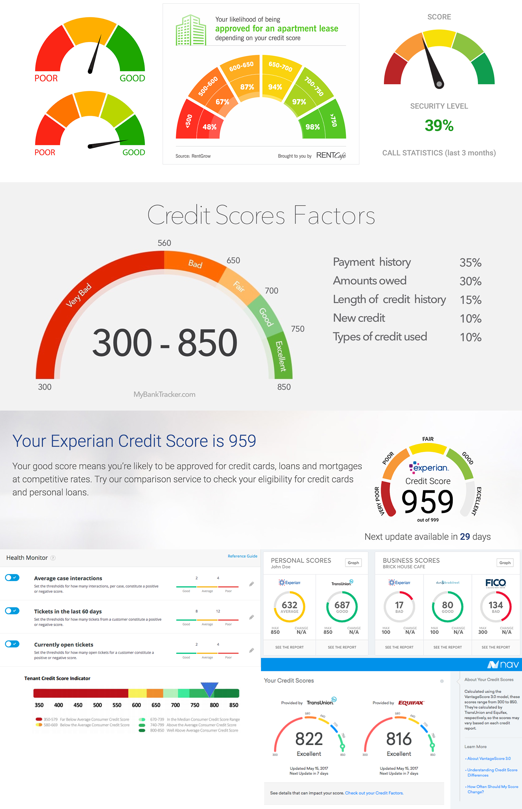
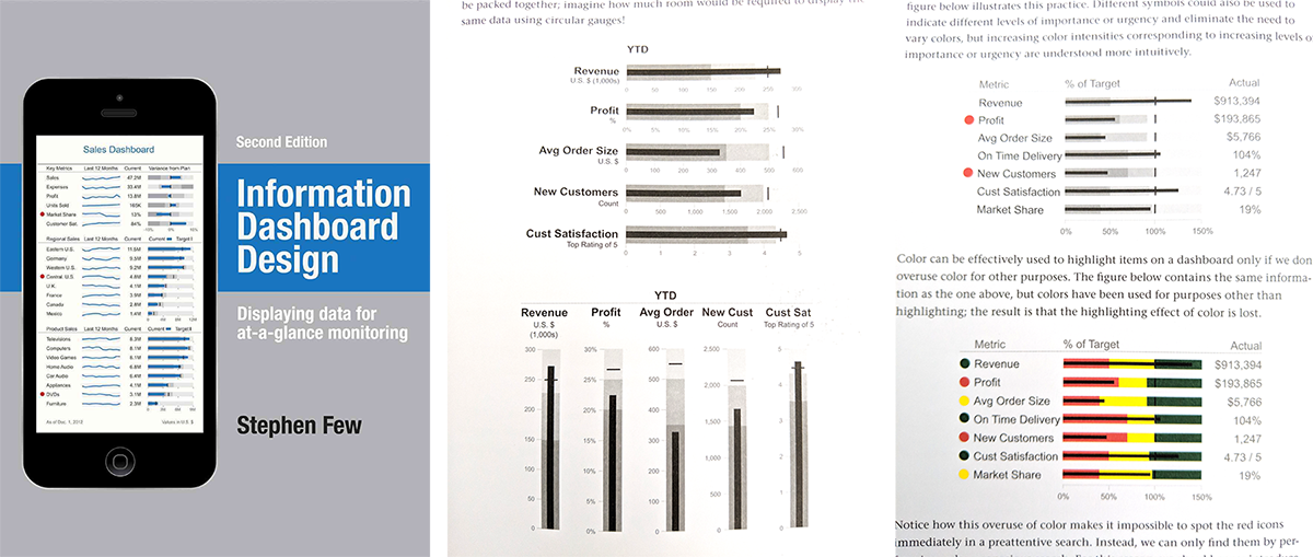
Ideas of the health score were informed by research done online, inspired by the books and in the office.
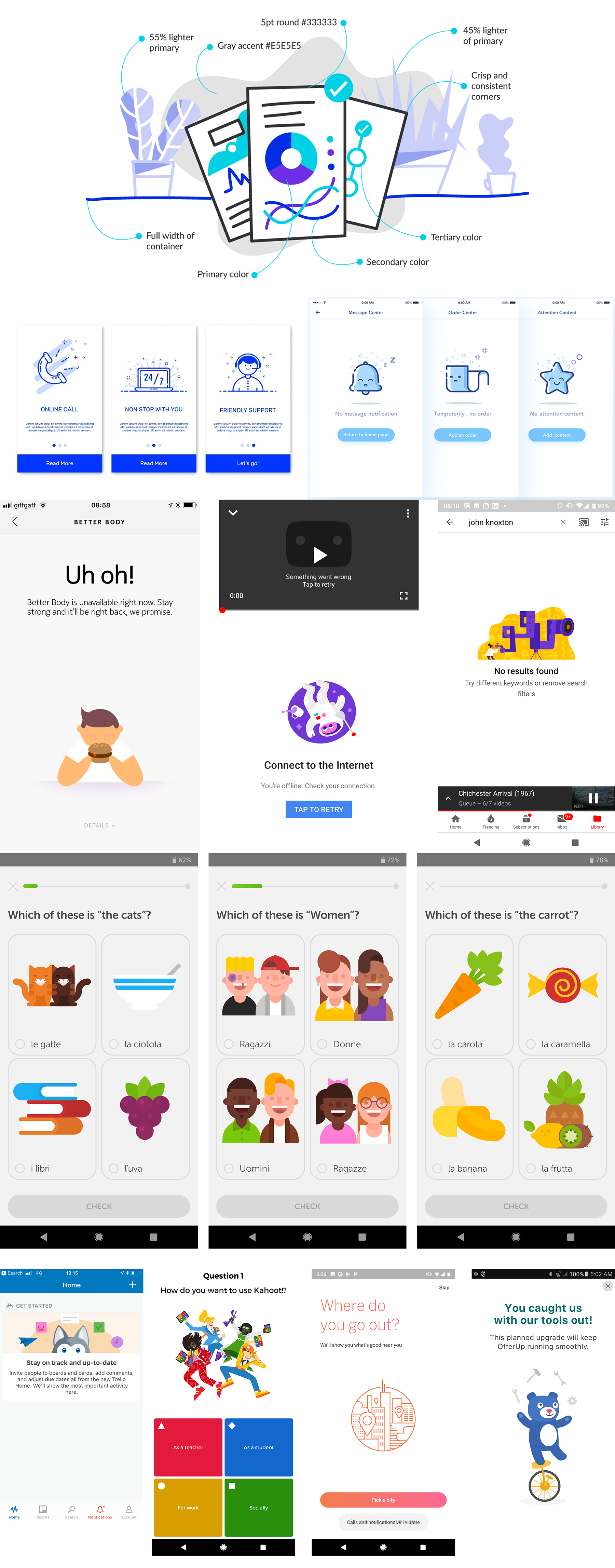
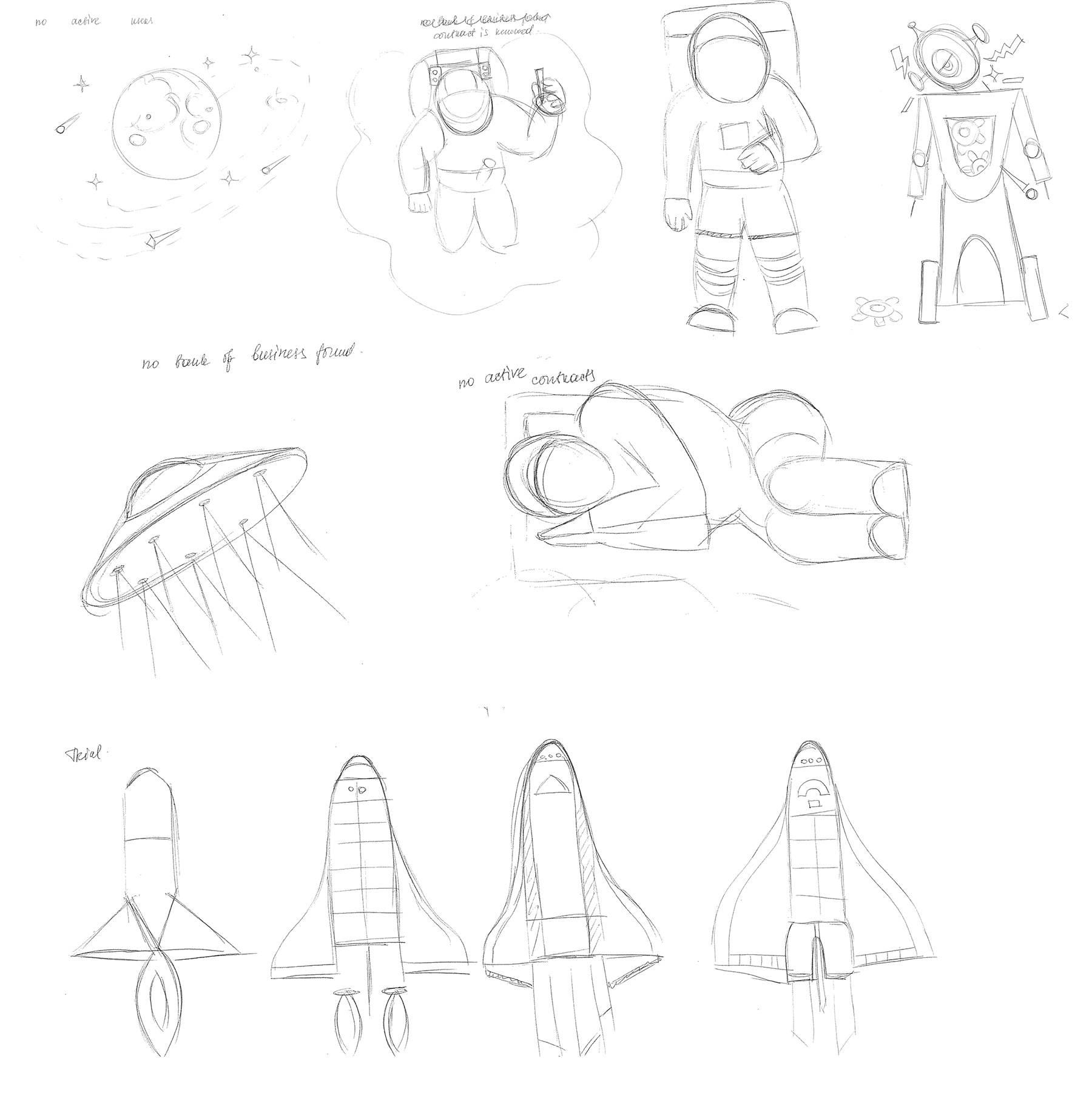
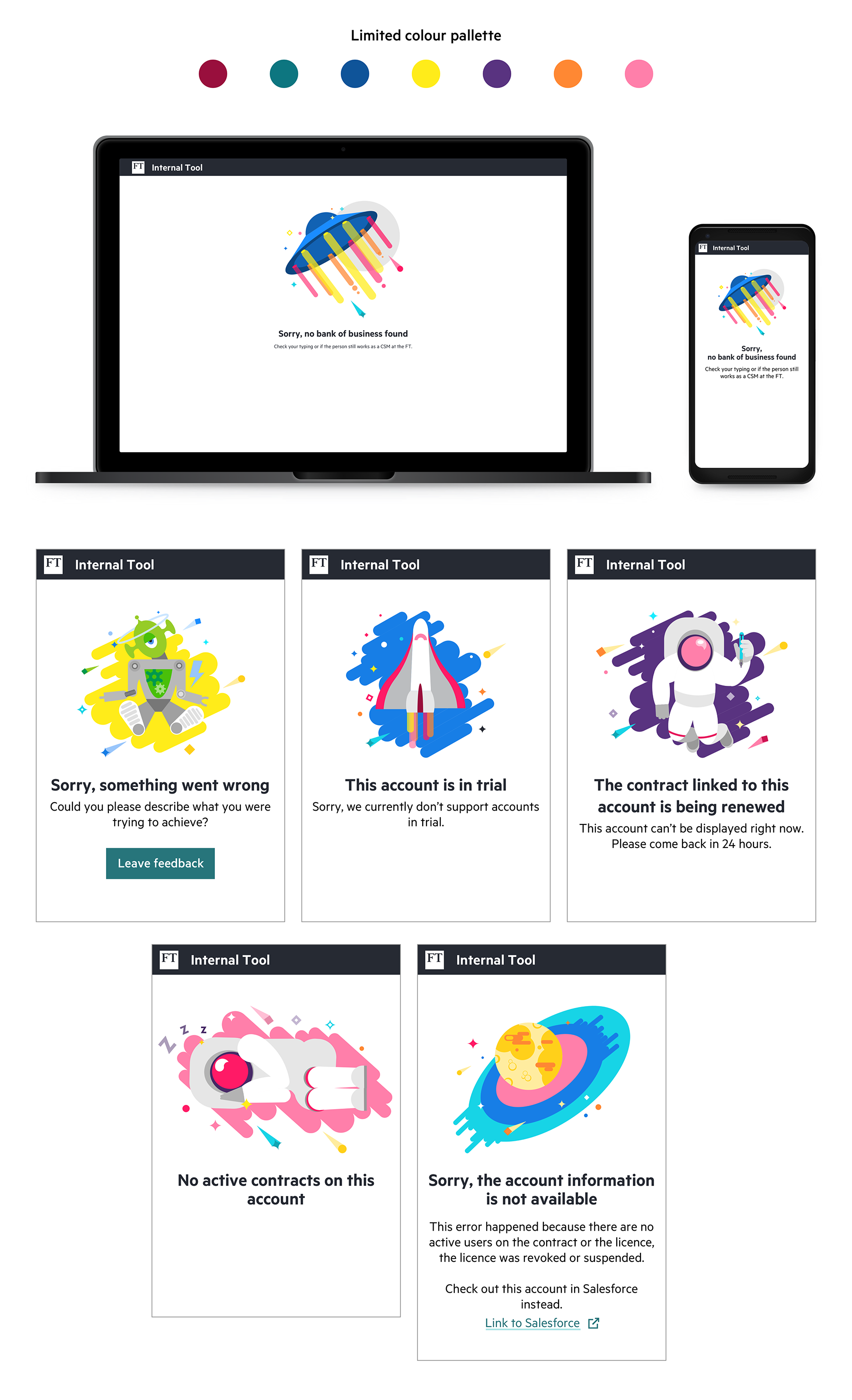
Who said that internal enterprise tools should be boring? I worked on illustrations for the empty states for 404 scenario (page not found), for random errors, for states when we couldn't get any data from another system in scenarios when a contract hasn't been renewed yet or there were no active users on the current account and for accounts in trials as the tool wasn't designed to support these accounts yet.
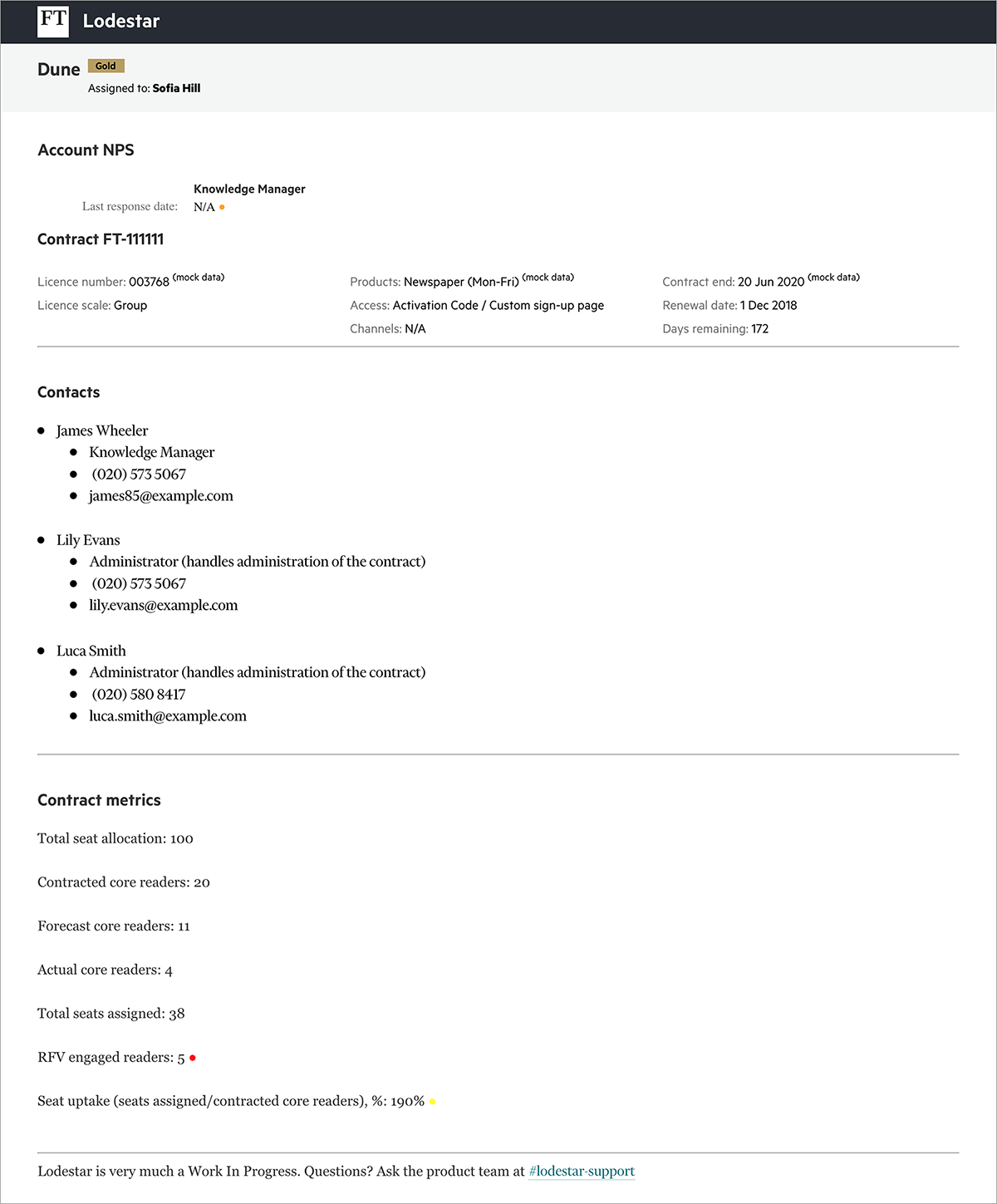
Bank of Business view (list view of the accounts) and the account page in their final iteration are presented below.
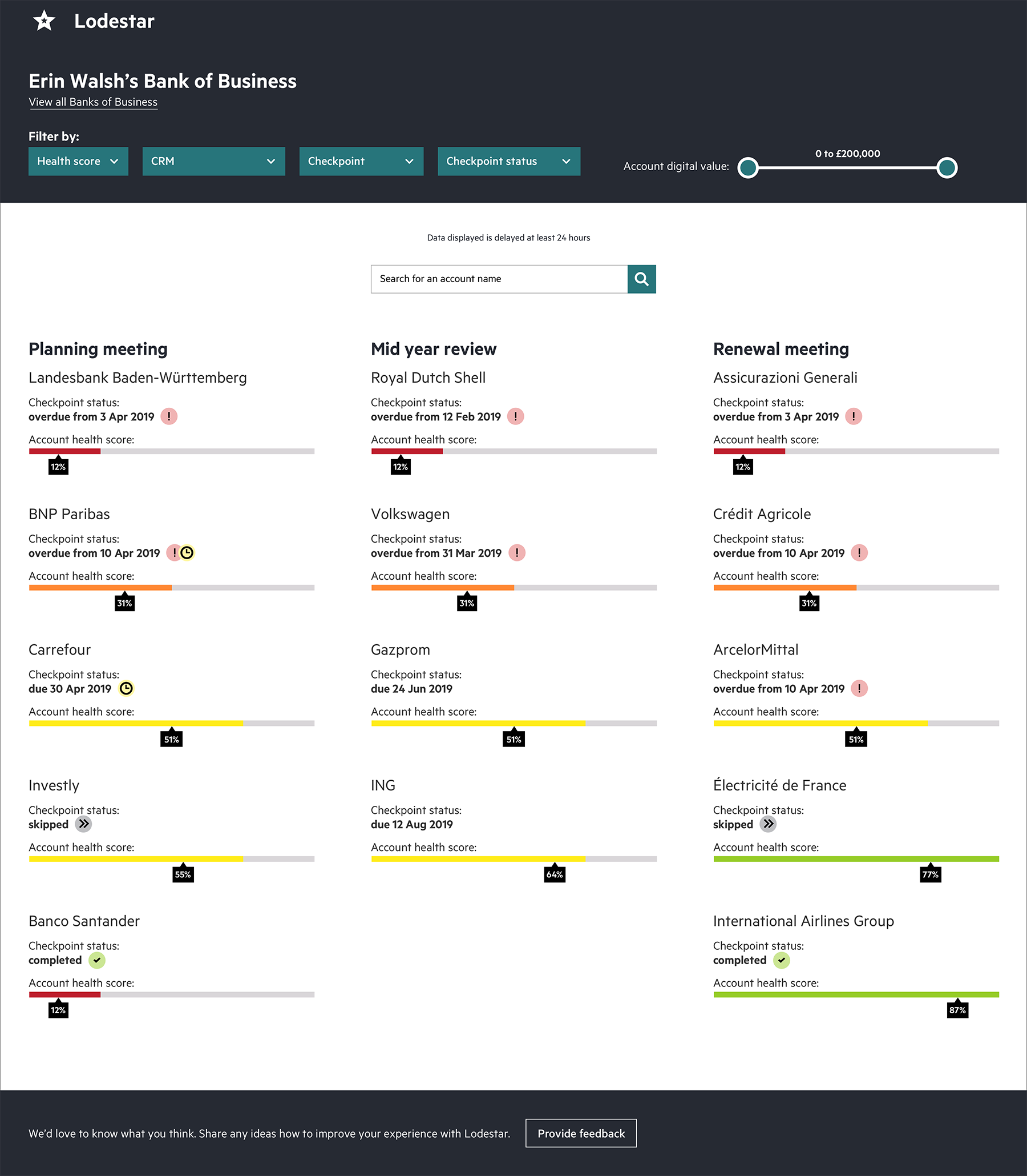
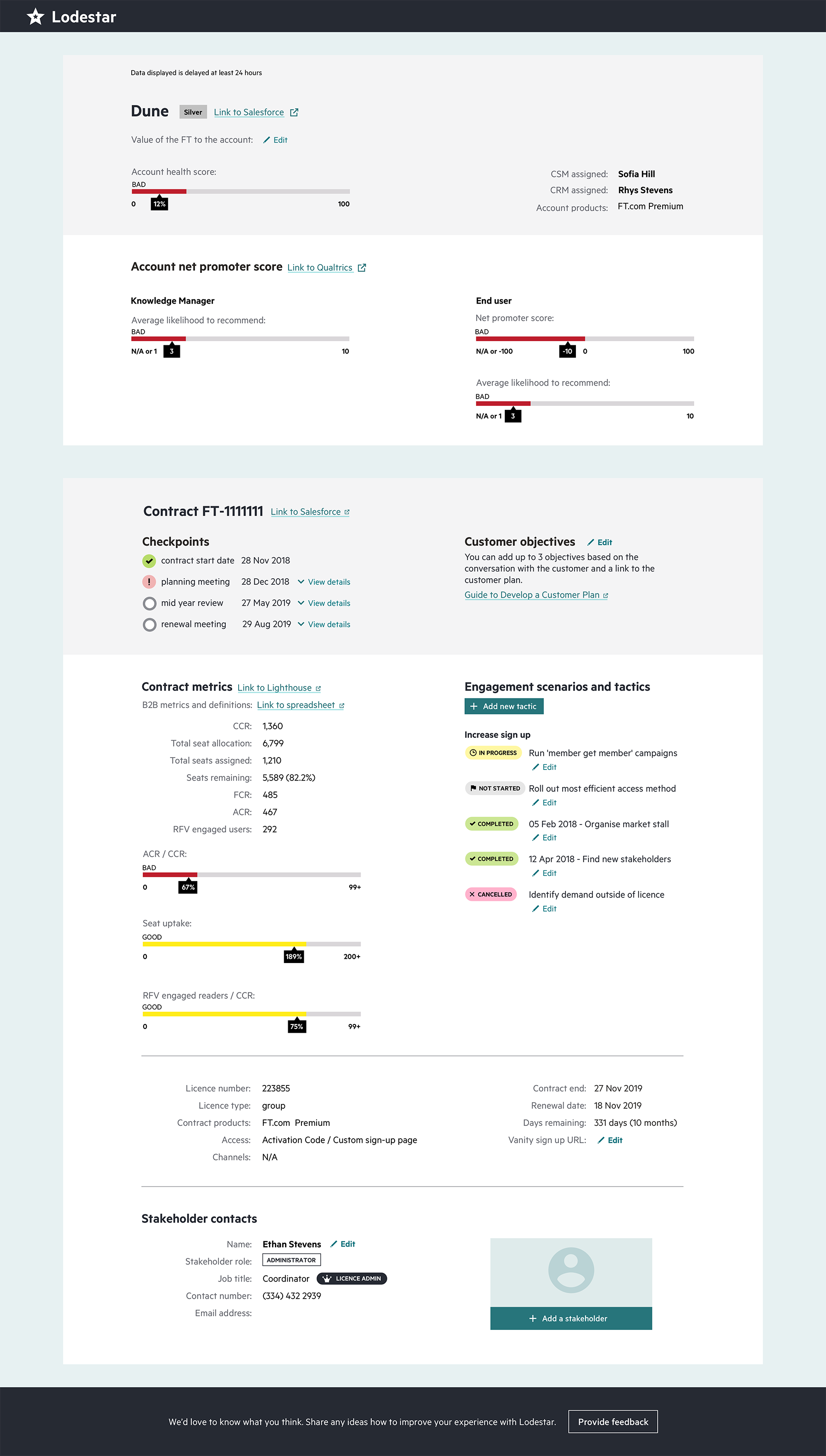
Accessibility: for this project we had to consider colour blindness as it was a known factor among users. First iteration of the health score indicator failed because indicating a different state with the colour only didn’t work. After that we ran more usability testing sessions to identify the best candidate for a health score indicator of the account that had 4 different states.
Usability testing sessions surfaced the fact that by building a tool alone will not solve all the problems, and there is a need to change a business process. B2B department hired a business technology training specialist who designed training sessions to align the global team on the process and how to use the tool. More specific metrics and analysis can be achieved when the tool is used over a longer period of time, i.e. at the end of calendar year.