Back to all web projects

Design principles & design system for Internal Products

All personal information is not real and was generated by the site uinames.com .

A set of multi-colour and monochrome icons
  used in the design system for Internal Products

Department goals

1. Create a single Sketch file with the components and symbols that are used in interfaces of Internal Products;

2. Create a set of design principles with the examples to help the design decision making for the teams with and without designers onboard.

Responsibilities

- Brainstorming with other designers that work on Internal Products;

- Documenting all the principles and known examples that fall under those principles into easily shareable slide deck;

- Documenting, breaking down into groups and reviewing with other designers elements and components that are used on Internal Products.

Team

Myself (Senior / Lead Product Designer on the Internal Products) and 2 other Product Designers on the programme.

Process

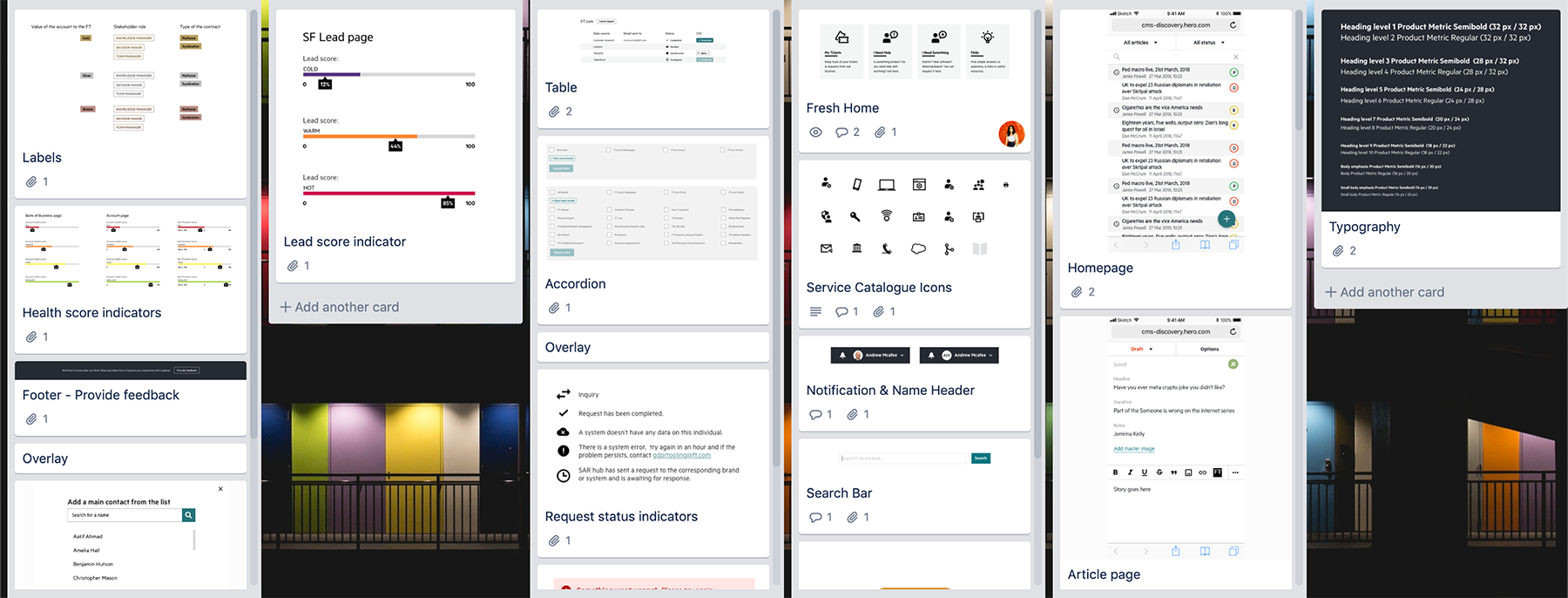
The initiative has started with the growth of the Internal Products department and the need to design tools consistently. When we had several designers working on Internal Products, I created a Trello board so all team members could contribute their patterns and collectively spot emerging themes. If a component was used by several teams, we could approach the Origami Team that builds patterns for developers.

A screenshot of the Trello board
    where all the designers added components they were using in the designs at a time.
Original Trello board with the design patterns on Internal Products.

Principles in no particular order

Familiar

Don’t reinvent the wheel and use familiar patterns. Our colleagues use apps with good user experience outside work so please reuse design patterns from champions in the field (Google can be a good example). Use the language that the users of the system are familiar with. It might include abbreviations that sound strange to the team that builds the tool but makes perfect sense for users. Follow real-world conventions, making information appear in a natural and logical order.


Example 1 - Order of the items

If you (not users) decide in what order to put the items in the list: it should have a function to be sorted alphabetically or/and chronologically it should be clearly explained in the interface what is the logic behind the order.


Example 2 - Currency format

In different countries currency sign can be displayed before or after the figure.
£127
127 USD
127 €

If you’re building the interface for the UK company, make it easier to read several different numbers in different currencies and follow the format of the pound sterling:
£127
USD127
€127

Although it is not internationally recognised standard, it will be easier for people to process a consistent format if several currencies are displayed in the same order.


Example 3 - Decimal and thousand separators

In different countries there are different rules how to separate thousands and decimals. If you are building a tool for UK and US staff, please choose the format accordingly.

  • 1,000,000.01
  • UK, US, Hong Kong
     
  • 1 000 000,01
  • Canada, Denmark, France, Finland, Sweden
     
  • 1.000.000,01
  • Italy, Norway, Spain
     
  • 1 000.000,01
  • Germany
     
  • 1,000,000·01
  • Philippines, Singapore


Example 4 - Reading pattern

In languages when people read left to right, reading pattern resembles letter F. For that reason, make sure that all headings and subheadings are left aligned to help people navigate the tool. Other things to consider: Start headings and subheadings with the words carrying most information: if users see only the first 2 words, they should still get the gist of the following section.


Example 5 - UK vs US spelling

Consider the audience you are building the tool for and make a decision what spelling to use.

  • British English 🇬🇧
  • Licence
  • Optimise
  • Per cent
  • American English 🇺🇲
  • License
  • Optimize
  • Percent


Clear

Use clear language and avoid ambiguity.
Call to actions, headers, tabs should have clear labels that can not be misinterpreted.
Keep your users informed and in control by providing informative and timely feedback tailored to the current situation.
Things that look the same should behave in the same way, and an action should always produce the same result.
Labels should use succinct, natural language with consistent capitalisation.


Example - Copy on the buttons and links
  • Examples of primary actions
    intend to enable form completion
  • Submit
  • Save
  • Continue
     
  • Examples of secondary actions
    used less and will not help the goal of completing a form
  • Cancel
  • Undo
  • Go back
 

Ensure that links include information-bearing words.

  • Good example
  • One-click sign up
  • Upload file
  • Add to calendar
     
  • Bad example
  • Go
  • Click here
  • More


Hierarchical

Make sure the layout has clear hierarchy, both visual and logical. I.e. if the layout should display a source of origin of the goods or items, hierarchy should be as follows: region > country > city > street > house number. Bad example: country > region > house number > street > city.


Focussed

Hick’s Law says that time it takes for a user to make a decision depends on the number of choices available — the higher the number the longer the decision time.


Keep interface focussed and provide clear cues what is a primary action, what is secondary and minimise the amount of options.


Avoid duplications of buttons, navigational components and other items on the page.


Placing similarly used functions or features together reduces cursor movement and makes the interface clear and consistent as well as increases discoverability of features.


Optimised

Interface of the system should be optimised to serve the user to perform the task in the most efficient way.


Accessible

Make sure that the interface is accessible (remember not all types of disability are visible!).


Example 1 - Colour contrast

Contrast colours need to be strong (use Web Contrast Checker )

  • Good example
  • A label on the badge background with the good contrast
  • Bad example
  • A label on the badge background with the poor contrast


Example 2 - Meaning

Use a combination of colour, shapes and text to convey the meaning of the call to action.

  • Good example
  • A badge that has coloured background, exlamation mark icon 
                          and a label
  • Bad example
  • A colourful circle


Example 3 - Context

Put buttons and notifications in context.

  • Good example
  • The search field with the button attached to it
  • Bad example
  • The search field and the button are disconnected
                        which makes it harder to understand it is a single component


Design elements

Below there are examples of atoms that make the design system: Colour, typography and icons.


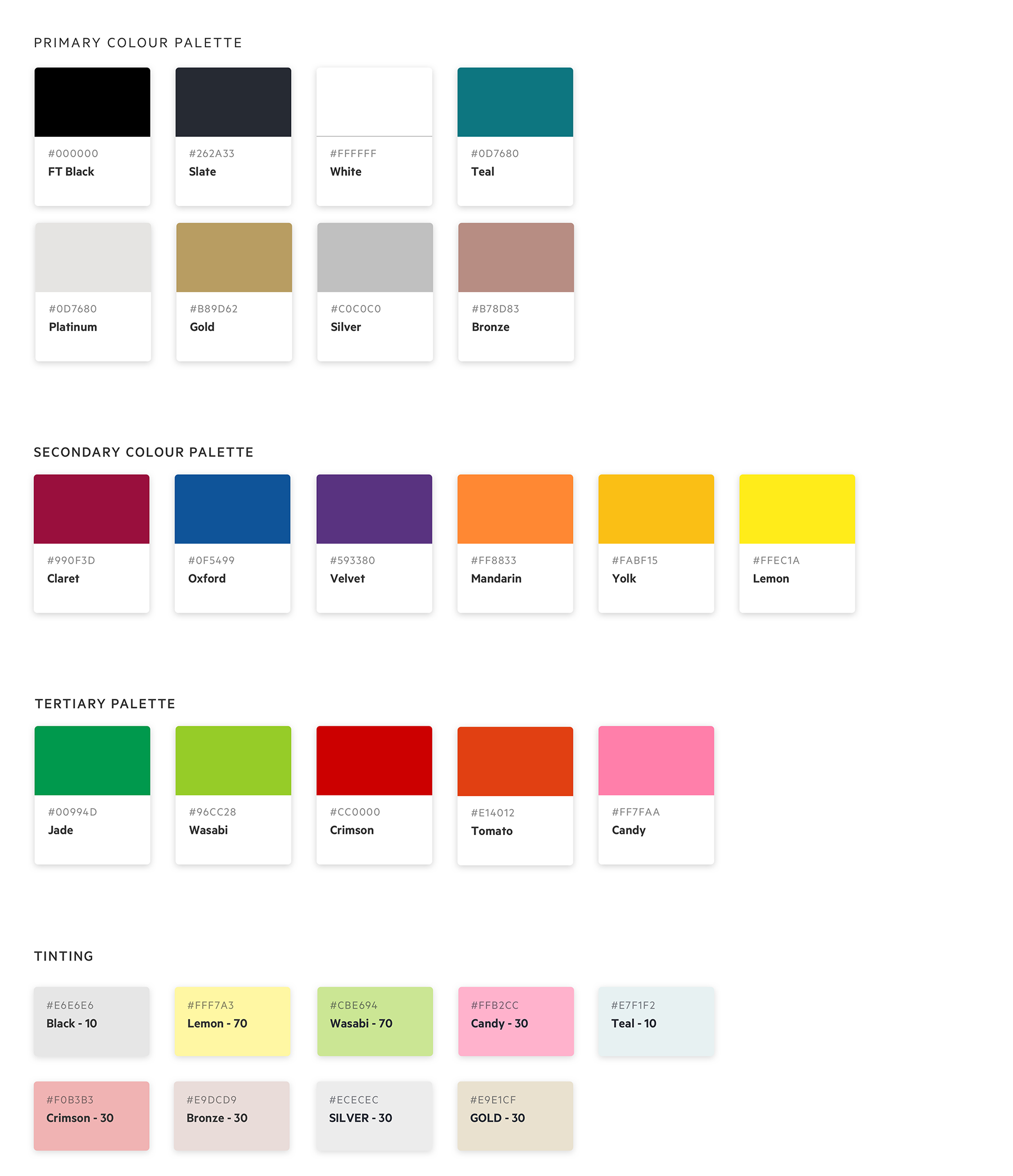
Colour
A diagram displaying the colour palette used in Internal Products.
Primary, secondary and tertiary colours as well as tinting samples that are received by adding white to original colours.


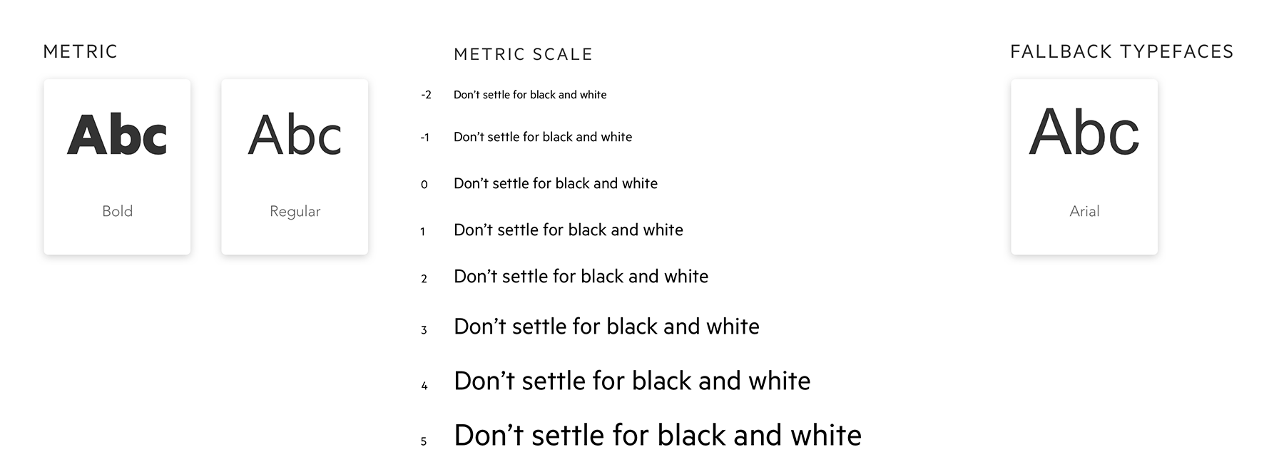
Typography
A mock-up representing typography with various scales of the typeface.
Typography styles and font scales.


Iconography
A mock up representing monochrome and multi colour icons as well as small fav icons.
Icons that are used in Internal Products. Internal Products have specific requirements for the types of icons that are different from the FT customer facing products.


Design components

Below there are examples of how atoms of the design system blend together to create more complex components - buttons, labels, filters, overlays, tables, etc.


Buttons
A mock up displaying all button types and links and their states.
All types of buttons and their states.


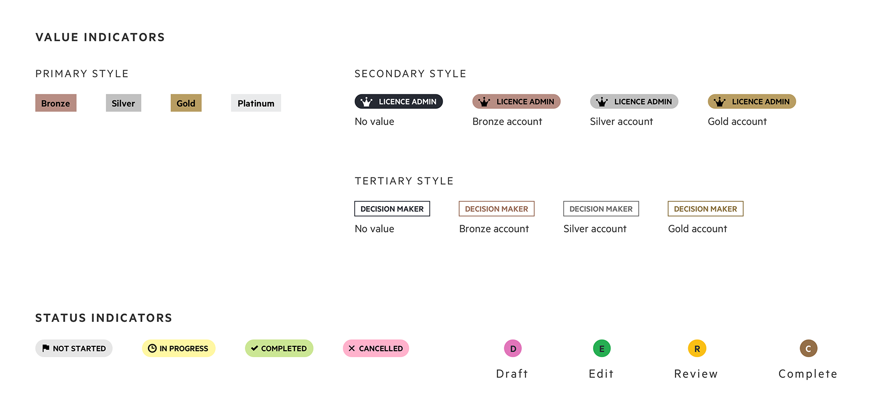
Labels

Labels can communicate several things:
- value of an account or a system;
- status of an account, an action or a system.
Style of value of an account or a system can influence the style of other labels. From accessibility standpoint it is better to use label with the icon but there are some examples of purely text labels.
Status indicator labels communicate the status of an action taken by the user in the system or the status of a certain stage of the process defined by the system.
These labels communicate the status of a story through its initial and colour. Tooltips allow the user to hover over a label to read the full title.

A mock up displaying all types of labels used in Internal Products. These include
                value indicators that have primary, secondary and tertiary styles and status indicators.
Label styles that indicate value and status.


Indicators

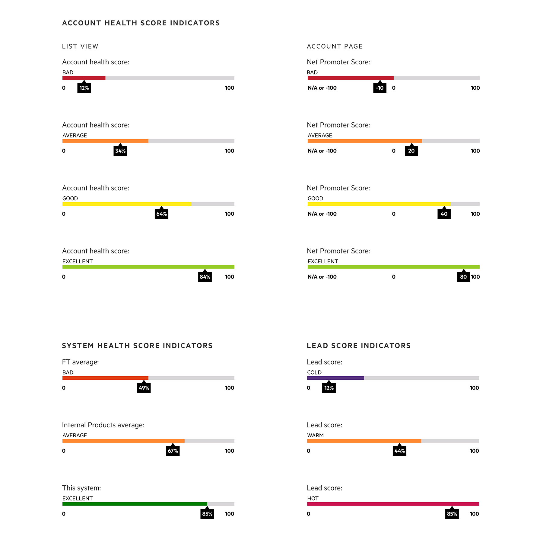
The indicators below represent the health of the account or system, propensity of the lead to convert and have at least 3 states.
Indicator should have the following elements:
- label describing what type of indicator it is;
- label describing the current state;
- label of current numeric value;
- labels of start and end numeric values (exception is the list view where these values are not essential and can clutter the view).

Typography within component should be Metric if a tool is standalone and built with the use of Origami components . If the tool is built to be a part of another system (i.e. Salesforce), typography should match the typography of that tool.

A mock up displaying all types of score indicators used in Internal Products. These include
                account health score, system health score and lead score having states from bad, average, good, excellent and cold, warm, hot.
Examples of the score indicators used by different systems.


Page filters

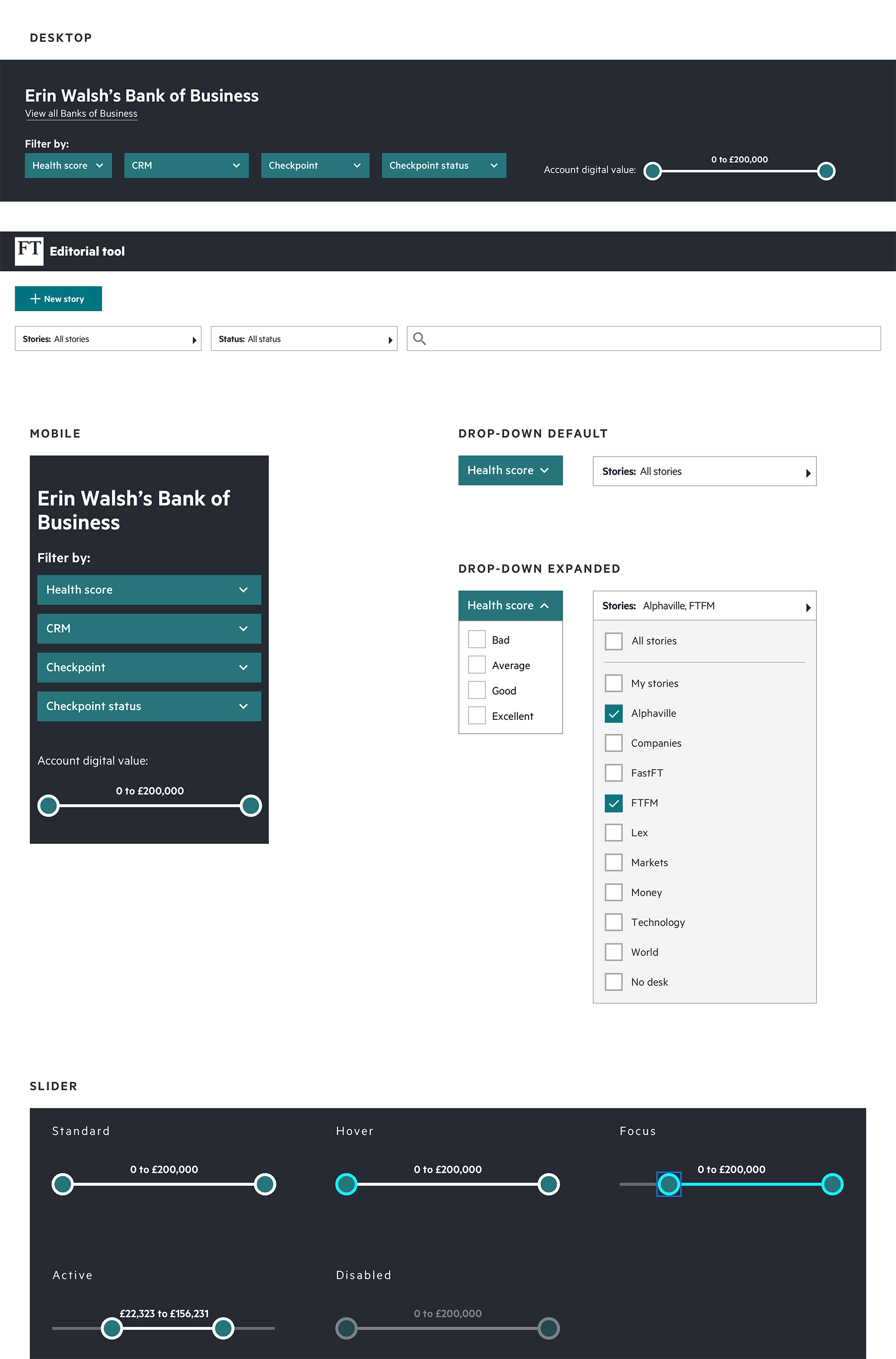
Filters are used to manipulate content on the page. Here are examples how groups of filters can be organised on desktop and on mobile.

A mock up representing all types of
                filters used in Internal Products.
There are 2 types of filters used in Internal Products: drop-downs and sliders.


A mock up representing loading indicators (light
                and dark themes
Types of loading indicators used in Internal Products.


Notes

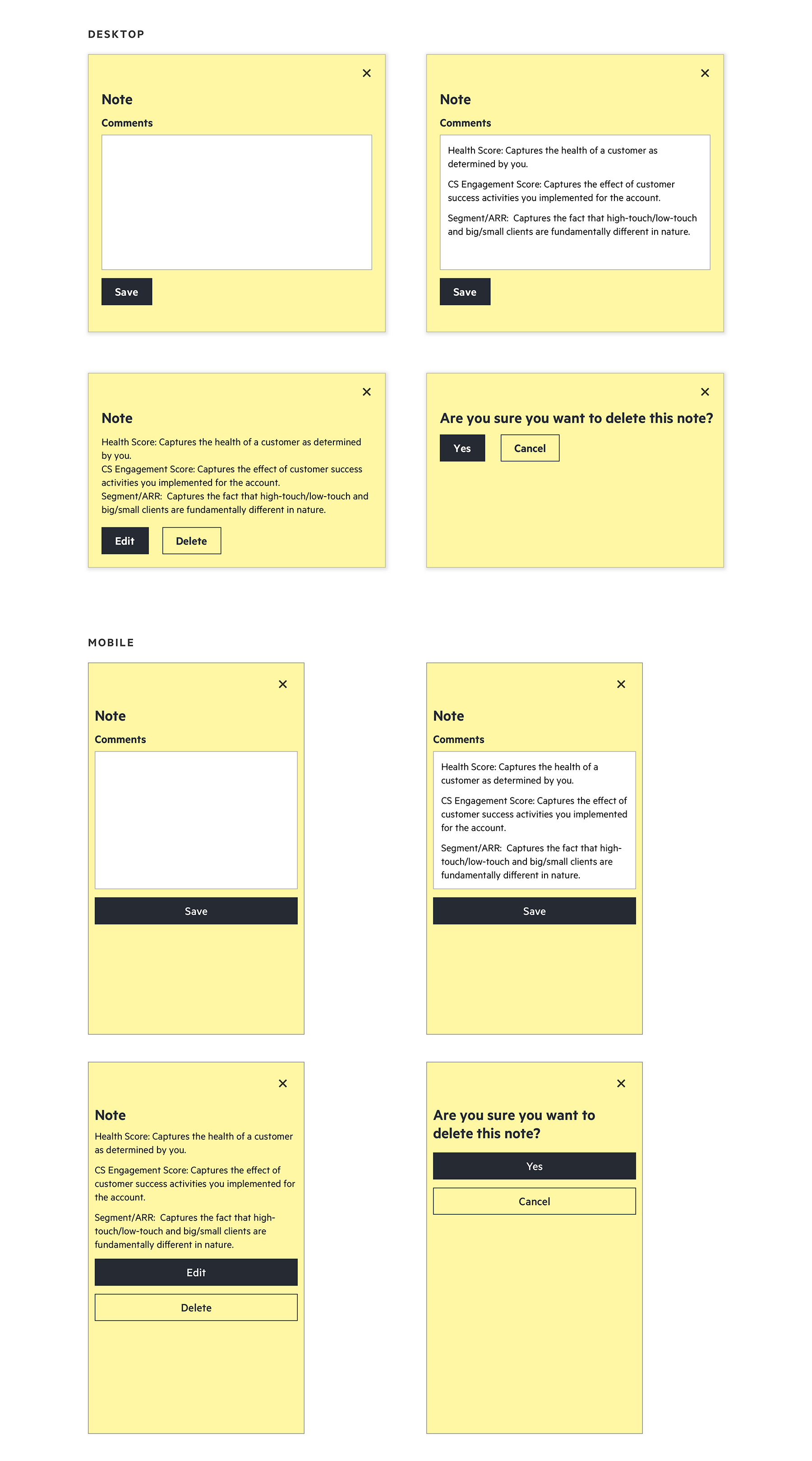
Notes component can be used on the interfaces of internal tools when there is a need to add a record or a comment that doesn’t fall under any data points or standardised manual input fields.

A mock up representing note component.
On desktop it is a small component that can be triggered by pressing a button. On mobile it is a full bleed screen.


Overlays
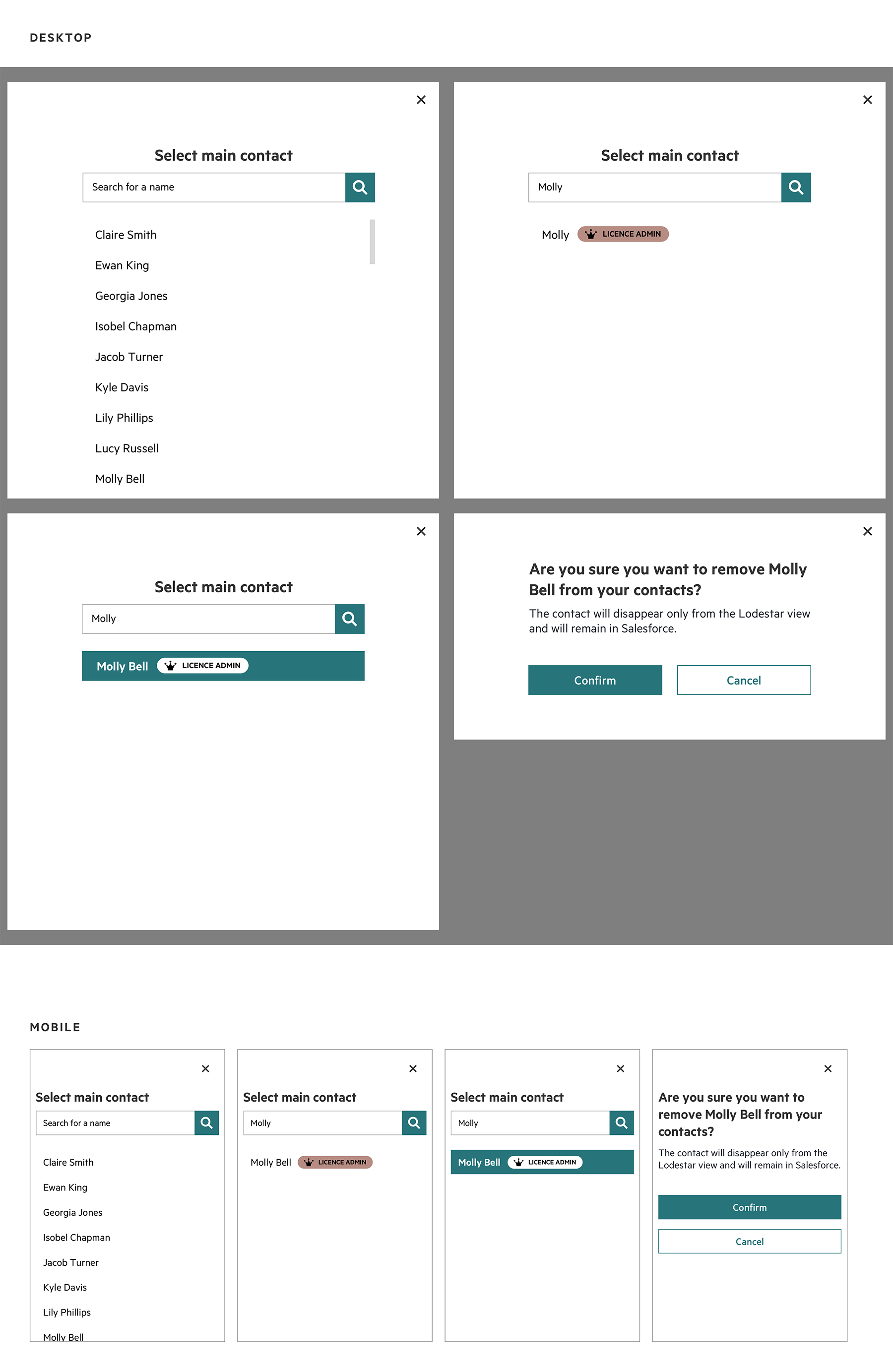
A mock up representing overlays and their behaviour on desktop and mobile.
Examples of overlays that become full bleed screens on mobile.


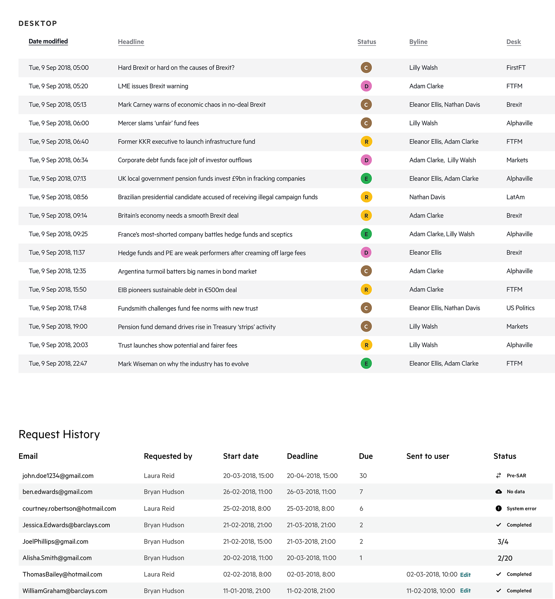
Data tables
A mock up representing table components. Desktop only.
Examples of tables on desktop.


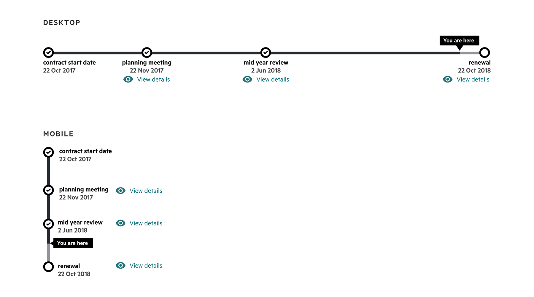
Timelines

Timeline is a way to represent a series of events. This particular example shows a contract lifecycle that has 4 stages with the dates and ability to view more information which can be displayed on a separate screen, in the tooltip or by pushing the rest of the content down.

A mock up representing timeline component and its behaviour on desktop and mobile.
Example of an event timeline that allows to see additional details.


LinkedIn Medium