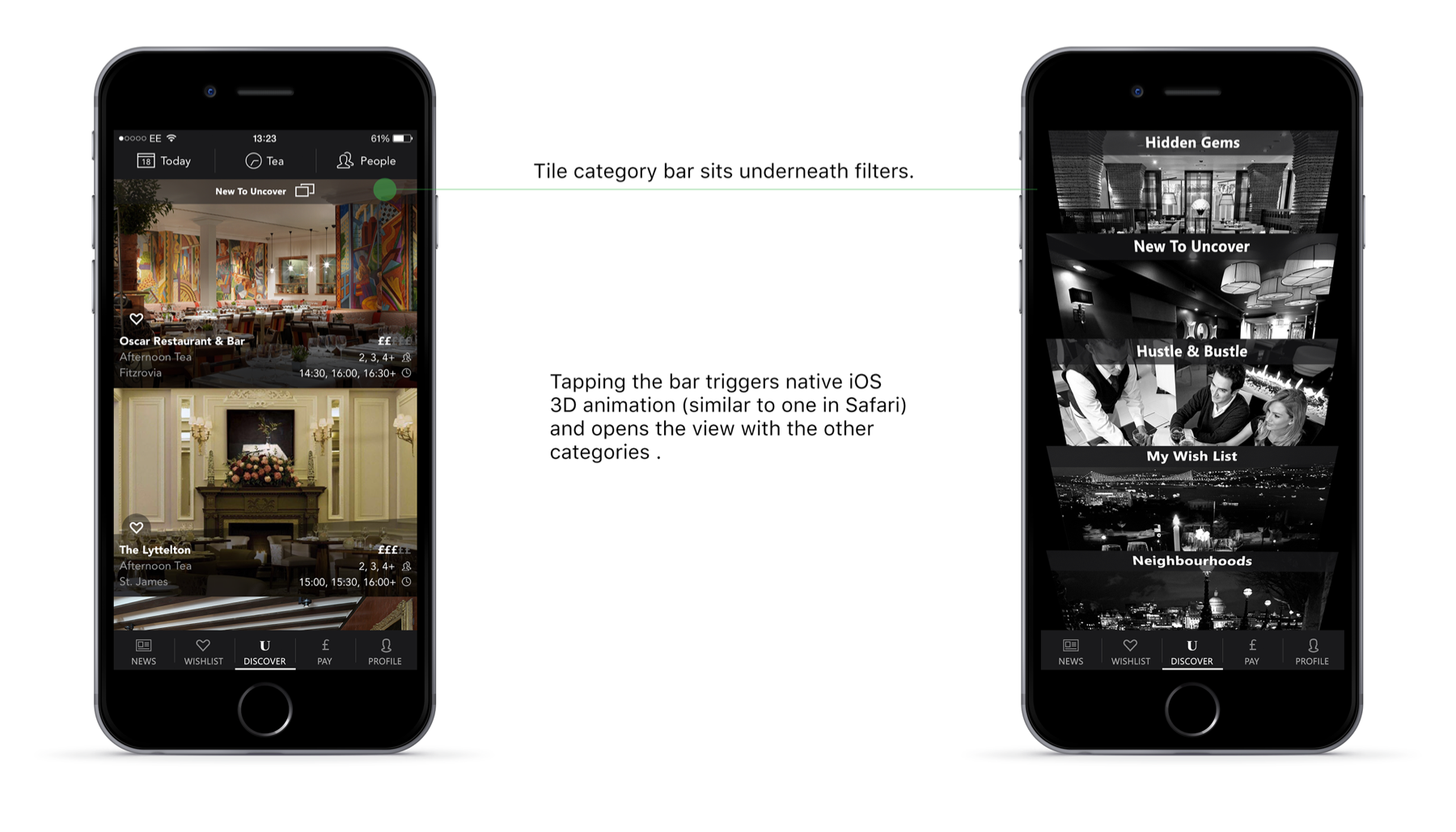
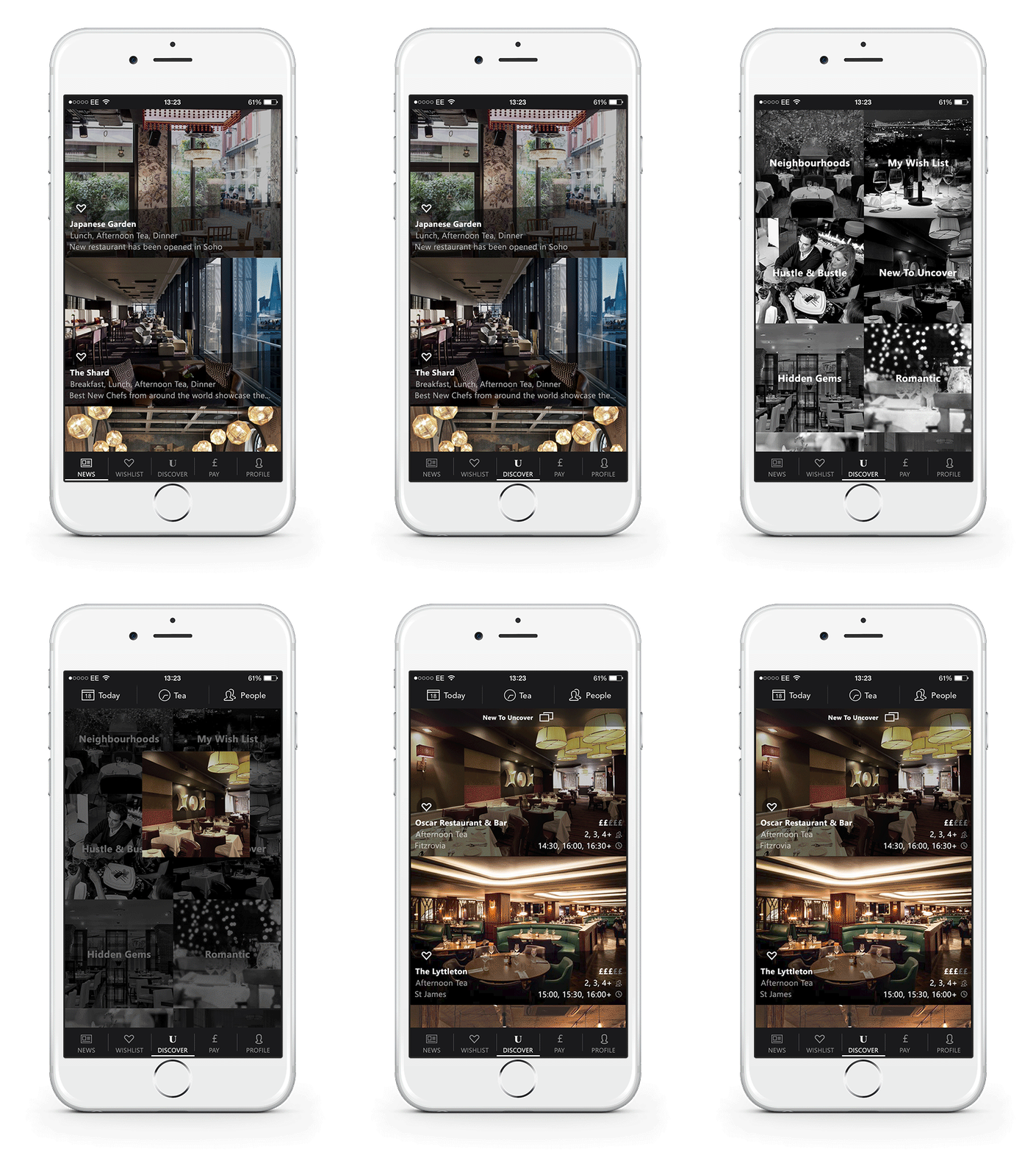
Tile menu exploration for Uncover
Uncover is the service dedicated to curated dining experience and targeting last minute bookings. Discovering a new venue is very important to the user so there's a task to improve the tile menu with categories.
Responsibilities
Explore new design of the home page.
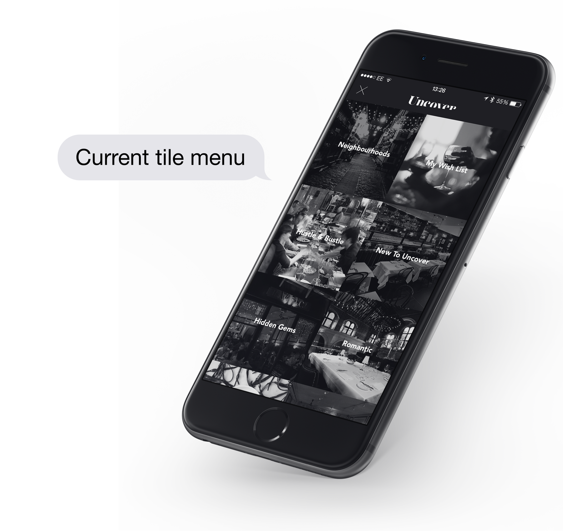
There are 14 categories in the menu which can become the part of the grid. To make the menu screen bold each card could have irregular height and width.
Larger units can be sold for ads or used to promote a certain category.
Option 1 - each card has regular corners, 1 wide cell and 6 smaller ones so 7 cards create
repeatable pattern.
Option 2 - each card has rounded corners, no wide cells, 6 cards create repeatable pattern,
to locate 14 categories 2 cards have the same height.
Option 3 - challenging from implementation support perspective but unique from
the design point of view, slanted shape is consistent with the app logo and other slanted UI elements in the app.
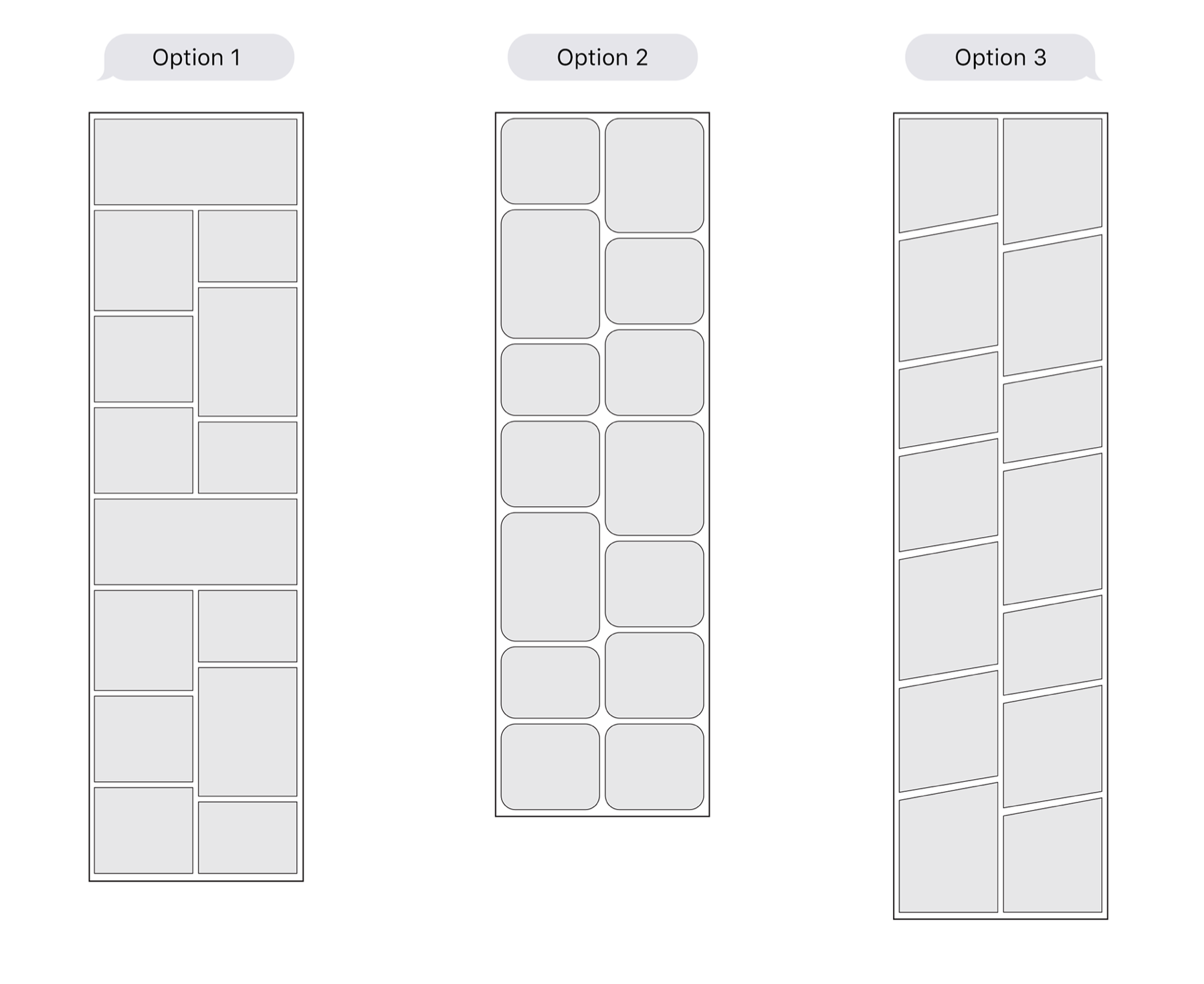
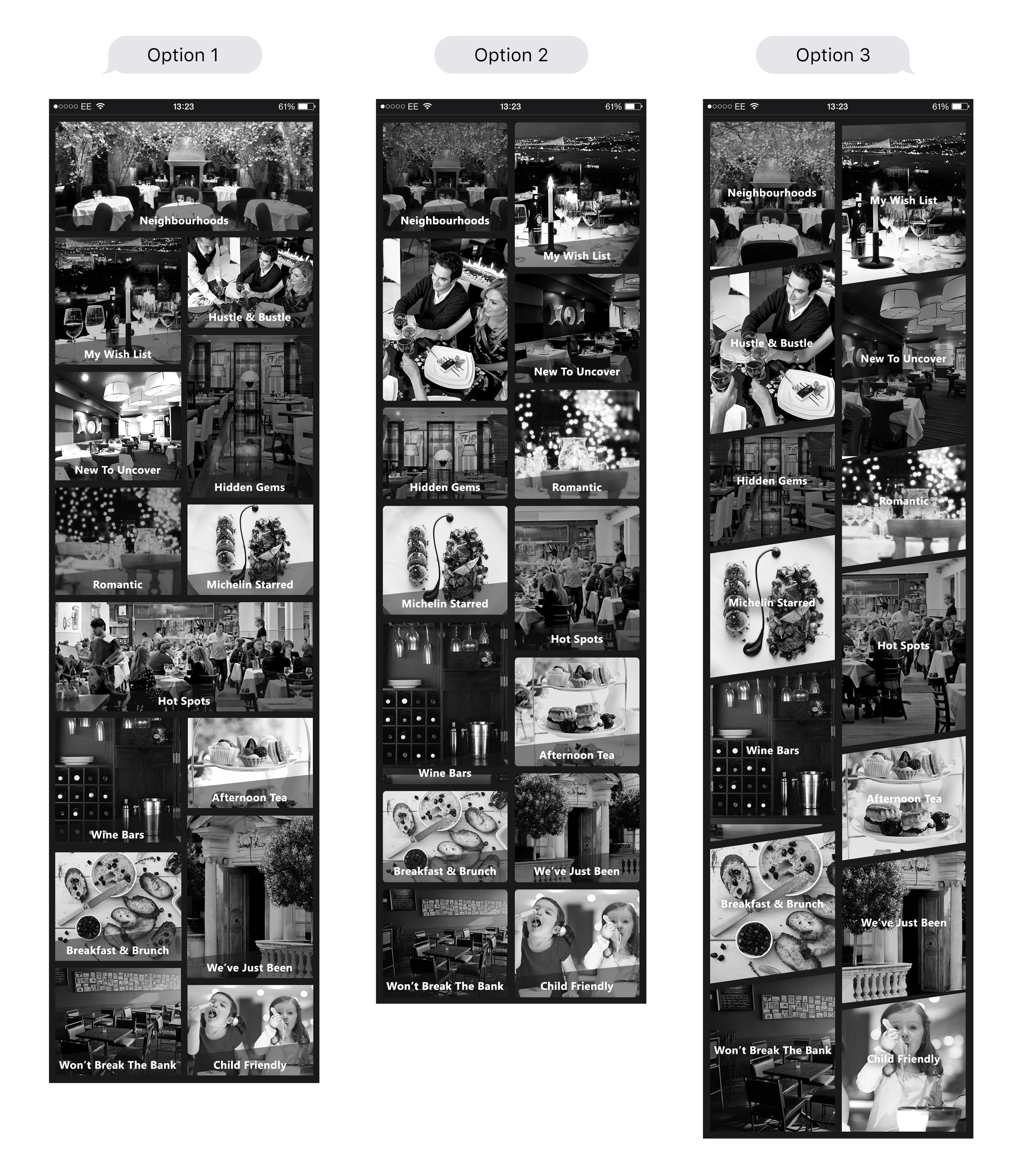
Visualization shows that users will need to scroll 3 times in design option 3 and just 1 time in design option 2. Aesthetics vs usability is the choice designers always have to face.
