UX solutions for Hungry House
Hungry House was the free & fast online ordering from restaurants across the UK. In 2017 it was acquired by Just Eat for £240m. This work was my assignment back at the end of 2015. As the service delivers food to millions of users it is very important to identify and solve problems with the experience on a constant basis. I was asked to find 1-2 problems and suggest solutions, explain what value it brings to the company and identify the ways to test suggested solutions. As usual I've started the process from reading the reviews in the stores and benchmarking. It is usually time consuming but definitely worth it!
User needs
Having read reviews in the markets, I've defined the following user problems:
- lack of restaurants in the certain area;
- limited choice of the cuisines;
- unable to load restaurants;
- users can't enter the discount code / coupon voucher;
- users are not happy about the long delivery time, their expectations do not coincide
with the real delivery time.
As user experience in all those cases expands far behind the mobile app itself (aspects as the traffic jams,
the restaurant is busy and can't prepare food on time, expanding the network of venues doesn't happen
very quickly, technical problems on the server, etc.), my work was more about improving navigation,
consistency of the tappable elements, clearer and nicer structure of the information.
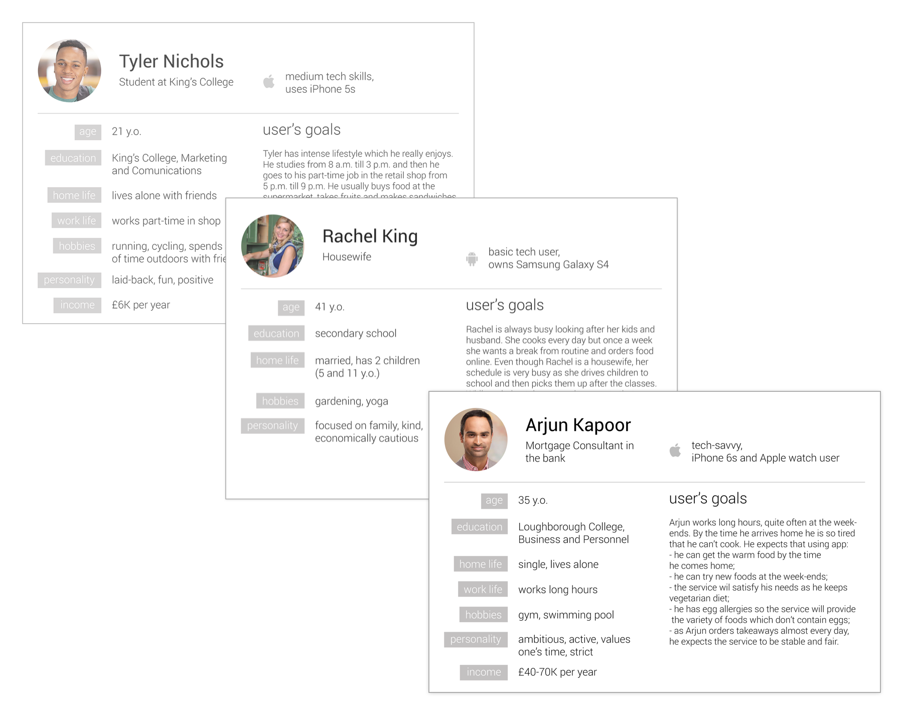
The great way to understand a user's behaviour is to create personas.
It is quite an abstract task in the absence of notes from the interviews or data
but then it helps the team to imagine personality types and think from their point of view.
Using data from servers is easier to create more precise personas but sometimes browsing reviews helps to
read between lines.
Benchmarking analysis
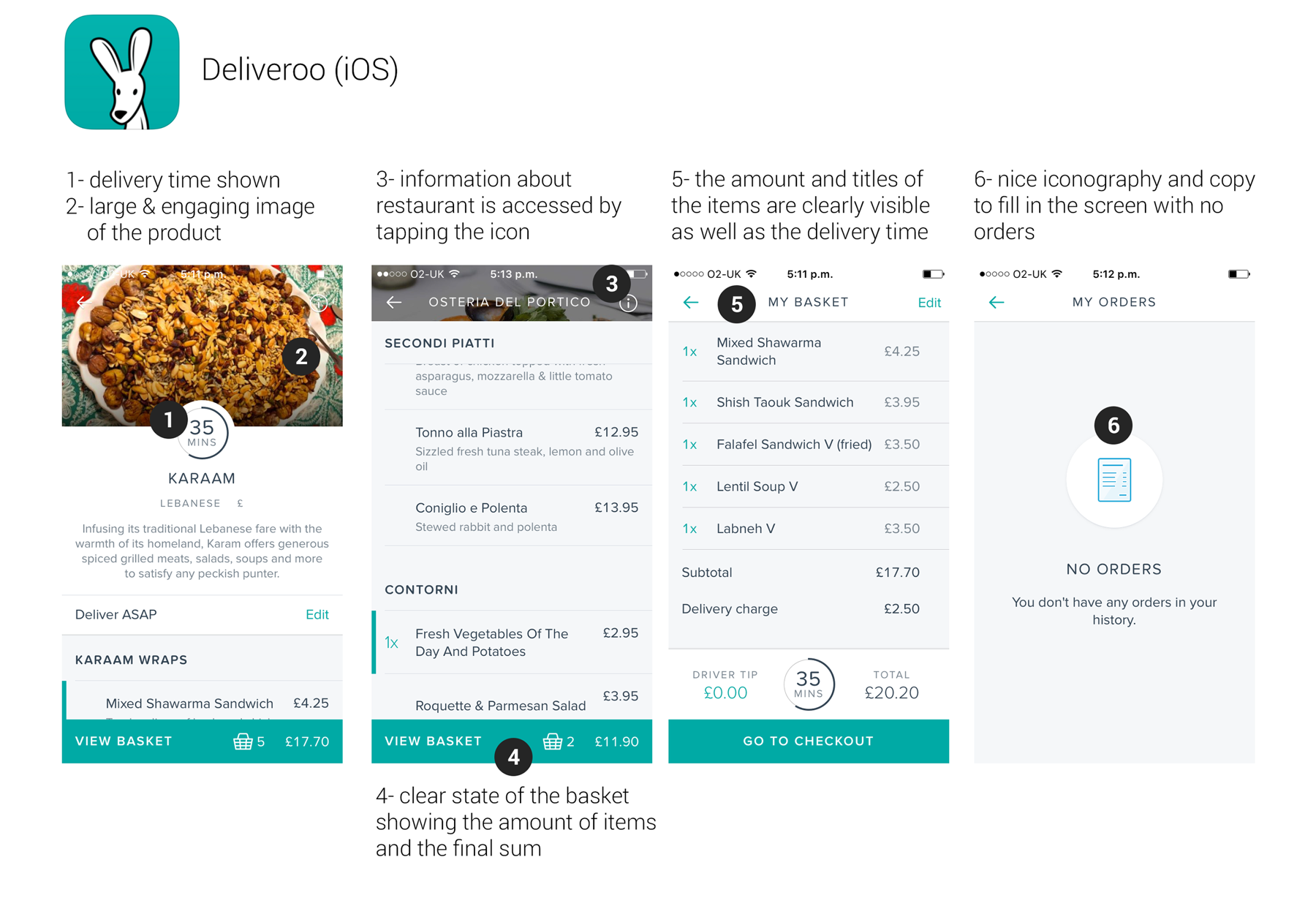
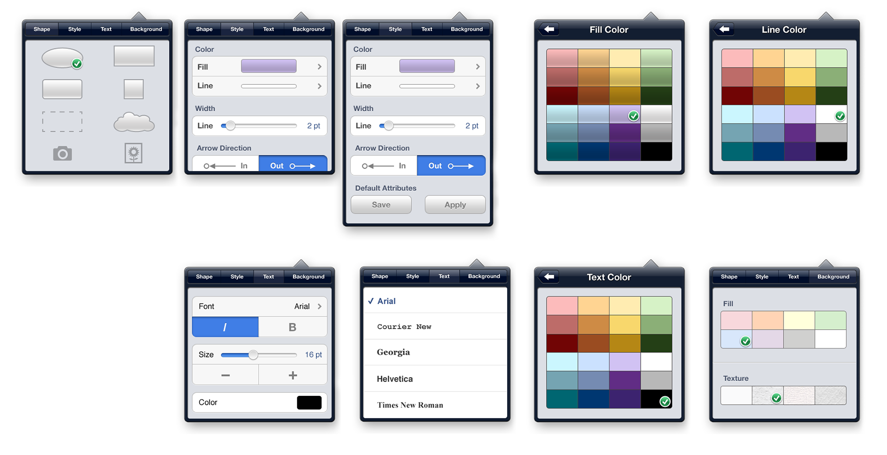
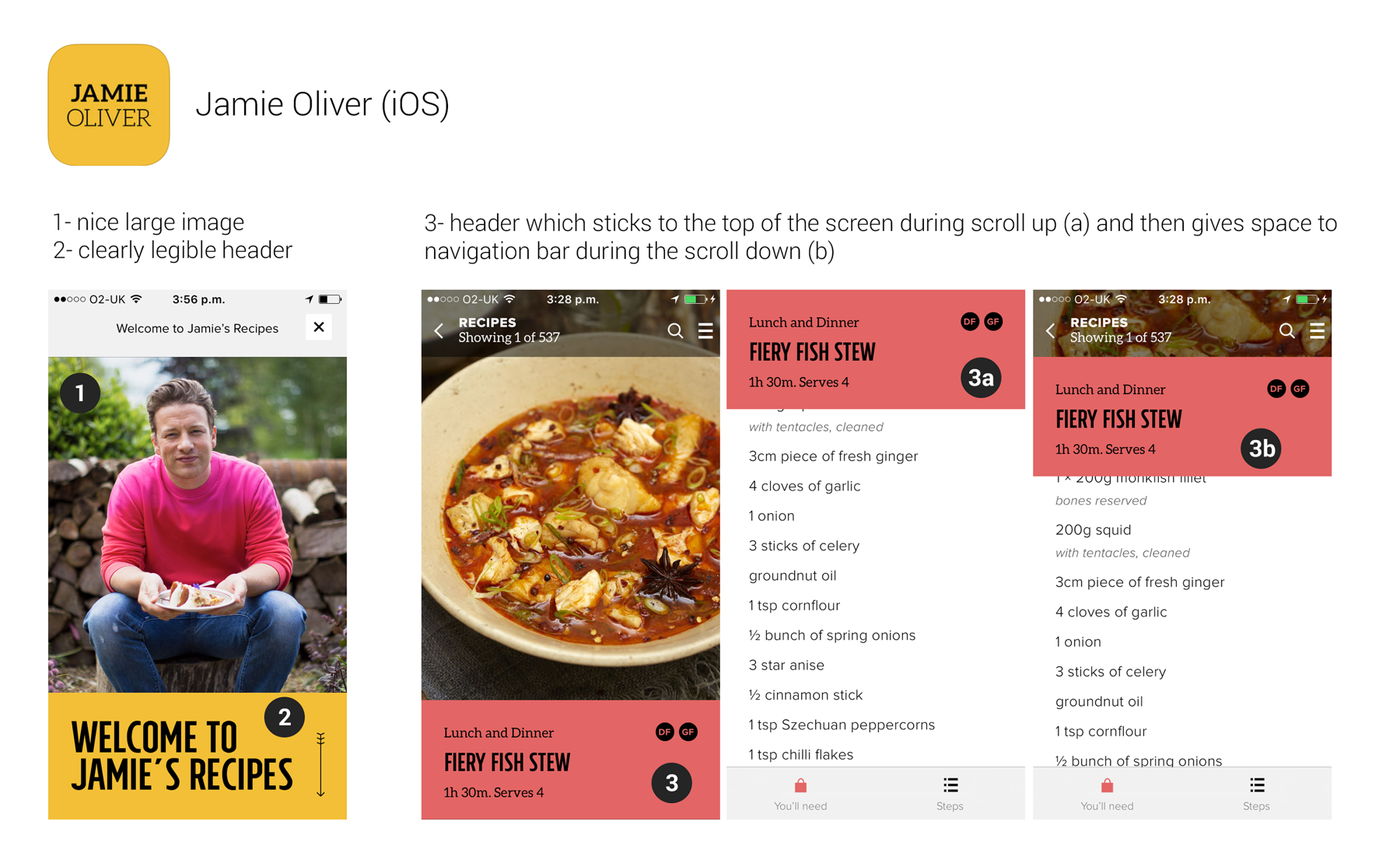
UX recommendations
Based on the feedback from users and benchmarking analysis, keeping user persona's thinking in mind I've created a list of recommended improvements:
1. In-app:
- feedback button inside the app to allow users leave complaints directly rather than post them on the store;
1.1. Android
- add some material design touch in terms of fonts and paddings, maybe floating button;
- 'Open now' and 'Closed' categories should stick at the top of the screen during the scroll (similar to Foodpanda);
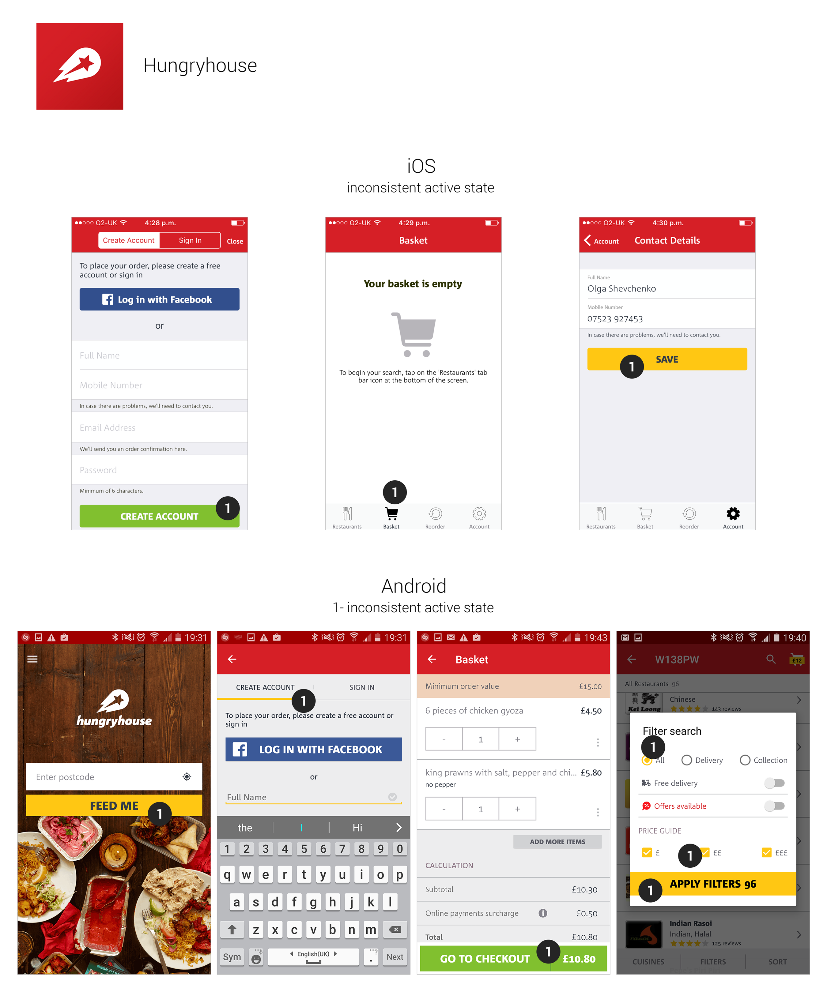
- in the list of restaurants app has chevrons which is an artifact of older iOS UI pattern; on Android all the
list do not have any chevrons and still users understand the cells are tappable.
1.2. iOS
- It is strange when a user needs to choose the details of the pizza and enter 2 levels of navigation inside, finally when he makes a decision, then he needs to tap 'Make a choice' 2 times to return to the previous page. It would be more convenient if the app redirected him back to the order page; Both iOS and Android apps need more consistency in the button colour. On iOS tabbar icons should have the same colour as all other buttons which are tappable. The same applies to Android – in pop-ups the button and checkboxes are yellow while in the rest of the screen the buttons are green. It is understandable to have the button of the different colour on the main screen as the background is the photo. Tabs also have a yellow underline.
2. Web-site:
- keeps asking to confirm the postcode (i.e. I enter the menu, choose the dishes, then go back to choose food from another restaurant, go inside the menu and for some reason the postcode I've entered disappears).
3. Both in-app and web-site
- in terms of expansion ask users what they want; implement a couple of
screens with the categories which answer the questions: What food would you like to see in the app?
What area would you like to be more covered?
- implement message centre with the restaurant in case there are problems with the order;
- add rewards / compensation / bonus points for the users who have waited for a long time
(2-3 hours above the promised delivery);
- display notifications or/and toast messages if the food is being late and present the exact time when
it is gonna be delivered; users like honesty – if the app says that the delivery time is in 10 minutes,
but in real time it is 35 then they will feel cheated and will not have any desire to use your app;
but if the app says – the estimated delivery time is approximately 30-35 minutes, it will be fair and
the service won't offend the user;
- show the user the estimated delivery time – it may be standard 1 hour delivery time which will cover
potential risks plus filter which will sort the restaurants based on their delivery time, i.e. user may want
to eat something quickly or may be in the mood to eat something new, delicious and more expensive thus one
can wait a bit; delivery by the time which user chooses;
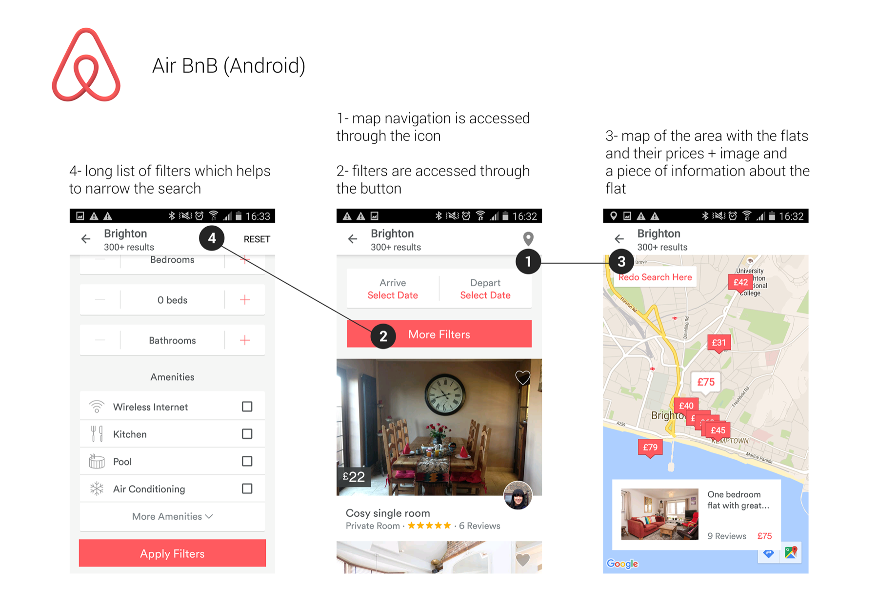
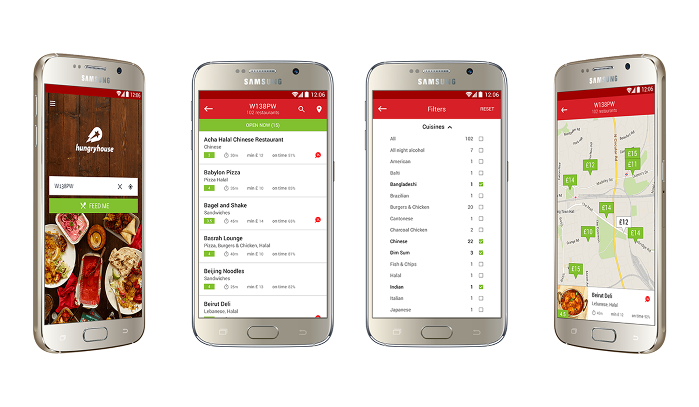
- search on the map (similar to AirBnB or YPlan) showing tags with the price of the average meal rather
than showing the map of each venue separately;
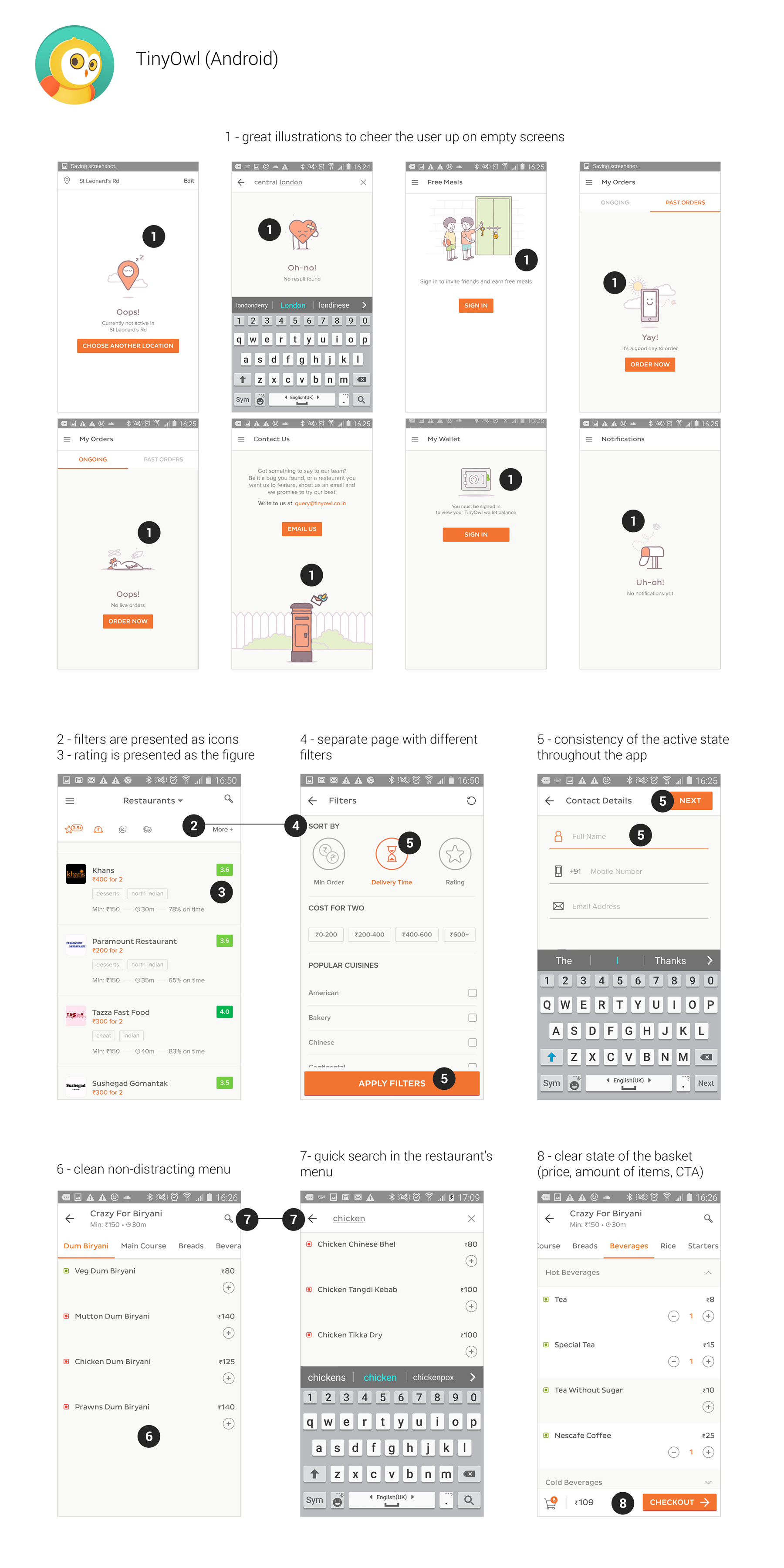
- quick search inside the menu of each venue as sometimes menus are too long;
- too many accents in the interface; recommendation is to reduce the amount of colourful
distracting elements in the app. i.e. maybe remove the logos of the restaurants;
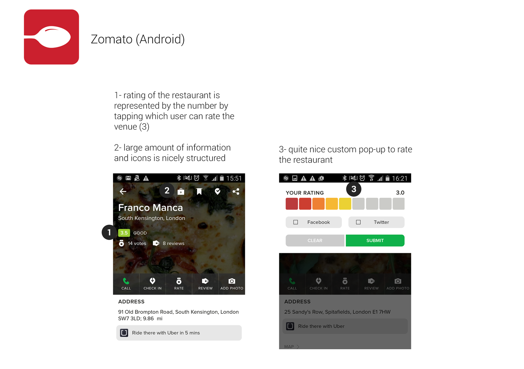
rating represented as the stars can simply be a number and take less space;
- add contextual filters: solo evening, romantic dinner, party with friends,
children's party, business lunch, etc. plus vegetarian, vegan, eco, organic food;
change the radio-buttons in the list of cuisines into check-boxes as it will allow user
to broaden the search (what if a user can't choose between Chinese, Thai and Vietnamese at the moment?)
- add more photos of the products because hungry users don't really care about the brand of the restaurant,
they would be more excited looking at the photo of the meal that is on it's way to their place;
in one of the ads on Hungryhouse YouTube channel the UI of the app contains exactly the images of the food;
- there's no functionality which allows me to choose food from different restaurants, every time
I've chosen the minimum required takeaway from one restaurant and try to add food from another restaurant
both iOS and Android app show me the pop-up if I'd like to cancel the previous order while the web-site
simply deletes previous data. What if users want to order food from several different venues in one go?
Amazon, for example, allows you to choose as many different products and items and check out every item
separately. With the current functionality show the basket just in the screens of the particular restaurant
to avoid misunderstanding. There is no point to show a basket on the screen with the list of all the restaurants
on Android and have the separate 'Basket' tab on iOS if users can choose food just from one venue.
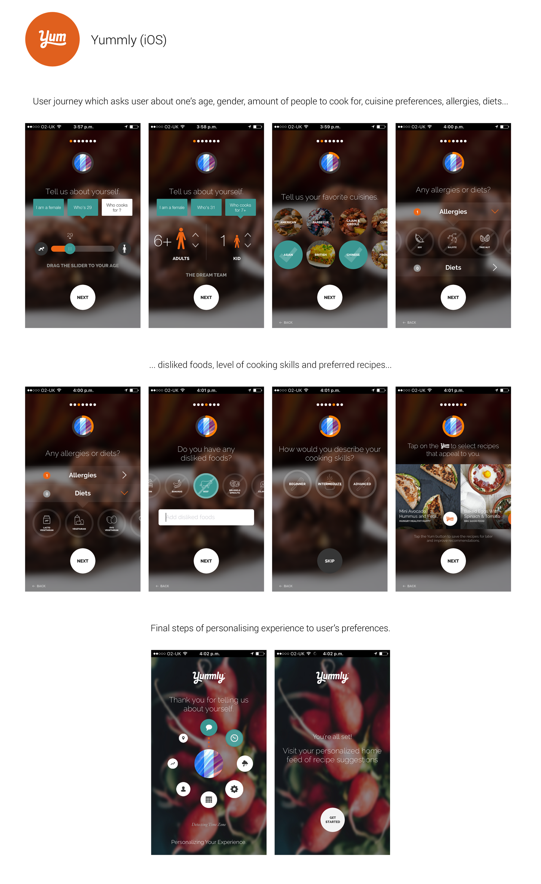
- personalise the experience per user, i.e. Yummly has a nice user journey at the beginning asking about
user's preferences in food, whether one has an allergy, what type of food one likes etc.